UI/UX Projects
for Emerson
UI/UX Projects
for Emerson
UI/UX Projects
for Emerson
Safety app, Walkdown app , CX Service portal, Global Portal, My asset landingpage
Safety app, Walkdown app , CX Service portal, Global Portal, My asset landingpage

Emerson is the global technology, software and engineering powerhouse

Emerson is the global technology, software and engineering powerhouse

Emerson is the global technology, software and engineering powerhouse
Overview of Emerson:
Overview of Emerson:
Overview of Emerson:
Emerson is a global technology and engineering company that provides innovative solutions for customers in industrial, commercial, and residential markets. The company is headquartered in St. Louis, Missouri, and operates in over 150 countries with approximately 88,000 employees. Emerson's product portfolio includes automation solutions, control valves, measurement instrumentation, and other related products and services. The company's mission is to help customers optimize their processes and achieve operational excellence.
Emerson is a global technology and engineering company that provides innovative solutions for customers in industrial, commercial, and residential markets. The company is headquartered in St. Louis, Missouri, and operates in over 150 countries with approximately 88,000 employees. Emerson's product portfolio includes automation solutions, control valves, measurement instrumentation, and other related products and services. The company's mission is to help customers optimize their processes and achieve operational excellence.
Problem faced by Emerson:
Problem faced by Emerson:
Problem faced by Emerson:
Emerson faced a problem with its outdated web interfaces that were developed using Oracle technology over 15 years ago. These interfaces were not only unappealing in terms of design but also limited in terms of functionality and user experience. The interfaces were not mobile-responsive, making it difficult for users to access them on different devices. As a result, Emerson's customers and employees were finding it challenging to navigate through the interfaces and were not able to complete their tasks efficiently. This was negatively impacting the company's business objectives, including customer satisfaction and employee productivity.
Emerson faced a problem with its outdated web interfaces that were developed using Oracle technology over 15 years ago. These interfaces were not only unappealing in terms of design but also limited in terms of functionality and user experience. The interfaces were not mobile-responsive, making it difficult for users to access them on different devices. As a result, Emerson's customers and employees were finding it challenging to navigate through the interfaces and were not able to complete their tasks efficiently. This was negatively impacting the company's business objectives, including customer satisfaction and employee productivity.
Emerson UI/UX Projects
Emerson UI/UX Projects
Emerson UI/UX Projects
My role was to research the big players in the field and come up with our own innovative ideas aimed at attracting an audience and internal gamification for the following applications -
My role was to research the big players in the field and come up with our own innovative ideas aimed at attracting an audience and internal gamification for the following applications -
Designing a Better Transaction
Experience for Emerson
Designing a Better Transaction Experience for Emerson
Designing a Better Transaction
Experience for Emerson
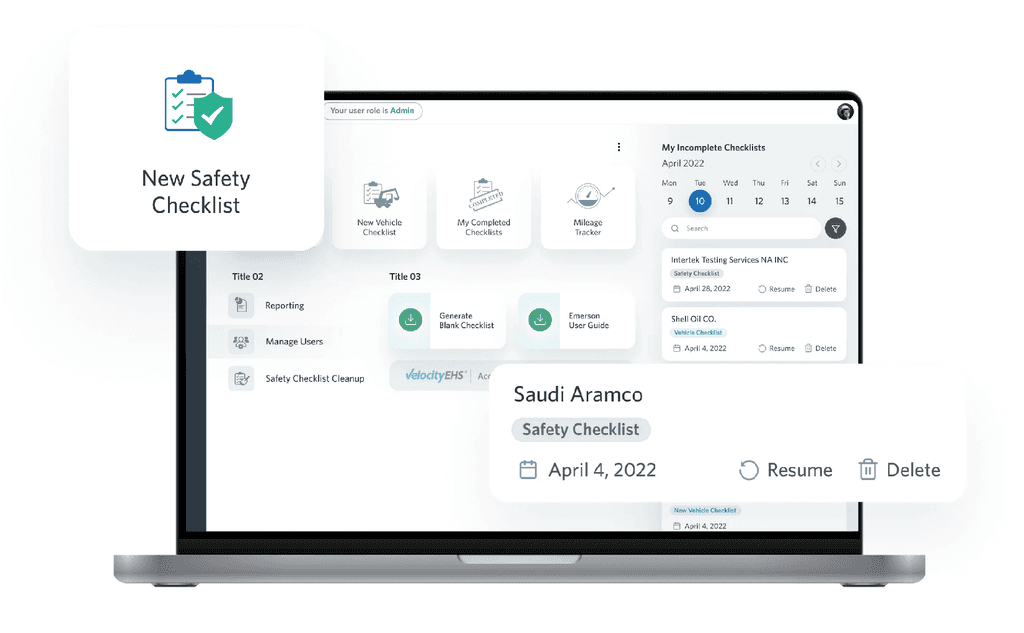


As part of my work as a Lead Design Consultatnt for Emerson, I was tasked with improving the user experience for their web-based products - the Safety App, CX Service Portal, and Walkdown App. After conducting thorough research and discovery activities, I identified that the outdated designs of these products were impacting their business by reducing user engagement and satisfaction.
As part of my work as a Lead Design Consultatnt for Emerson, I was tasked with improving the user experience for their web-based products - the Safety App, CX Service Portal, and Walkdown App. After conducting thorough research and discovery activities, I identified that the outdated designs of these products were impacting their business by reducing user engagement and satisfaction.
One of the key issues with the existing interfaces was the difficulty in navigating through them, which was leading to frustration and confusion among users. To address this, I worked with Emerson's product managers and UX writers to define a system for optimizing the navigation experience.
One of the key issues with the existing interfaces was the difficulty in navigating through them, which was leading to frustration and confusion among users. To address this, I worked with Emerson's product managers and UX writers to define a system for optimizing the navigation experience.
For the Safety App, we identified that users were having difficulty accessing critical information during emergency situations. To address this, I redesigned the app's layout and prioritized critical information such as emergency contact numbers and procedures.
For the Safety App, we identified that users were having difficulty accessing critical information during emergency situations. To address this, I redesigned the app's layout and prioritized critical information such as emergency contact numbers and procedures.
For the CX Service Portal, we noticed that users were having difficulty finding the relevant resources and support articles to address their queries. To address this, I worked on a new categorization and labeling system for the support articles to make them easier to find and understand.
For the CX Service Portal, we noticed that users were having difficulty finding the relevant resources and support articles to address their queries. To address this, I worked on a new categorization and labeling system for the support articles to make them easier to find and understand.
Safety App Redesign
Safety App Redesign
Safety App Redesign
Emerson is the global technology, software and engineering powerhouse driving innovation that makes the world healthier, safer, smarter and more sustainable
Emerson is the global technology, software and engineering powerhouse driving innovation that makes the world healthier, safer, smarter and more sustainable
Skills
Skills
Prototyping
Prototyping
User experience design
User experience design
User Interface Design
User Interface Design
User Research
User Research
Time
Time
2 Months
2 Months
July 2022
July 2022
Specifications
Specifications
Specifications
Safety App demonstrated how different users could view and interact with their digital product on various devices. Even though it might seem that the integrity of the design components varies on each screen, they do relate to each other. They connect and make up a global design language that distinguishes Safety App from similar solutions.
Safety App demonstrated how different users could view and interact with their digital product on various devices. Even though it might seem that the integrity of the design components varies on each screen, they do relate to each other. They connect and make up a global design language that distinguishes Safety App from similar solutions.


Pain Points
Pain Points
Pain Points
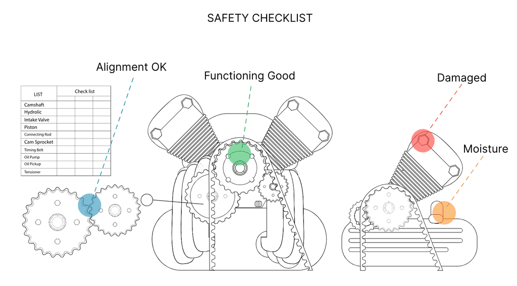
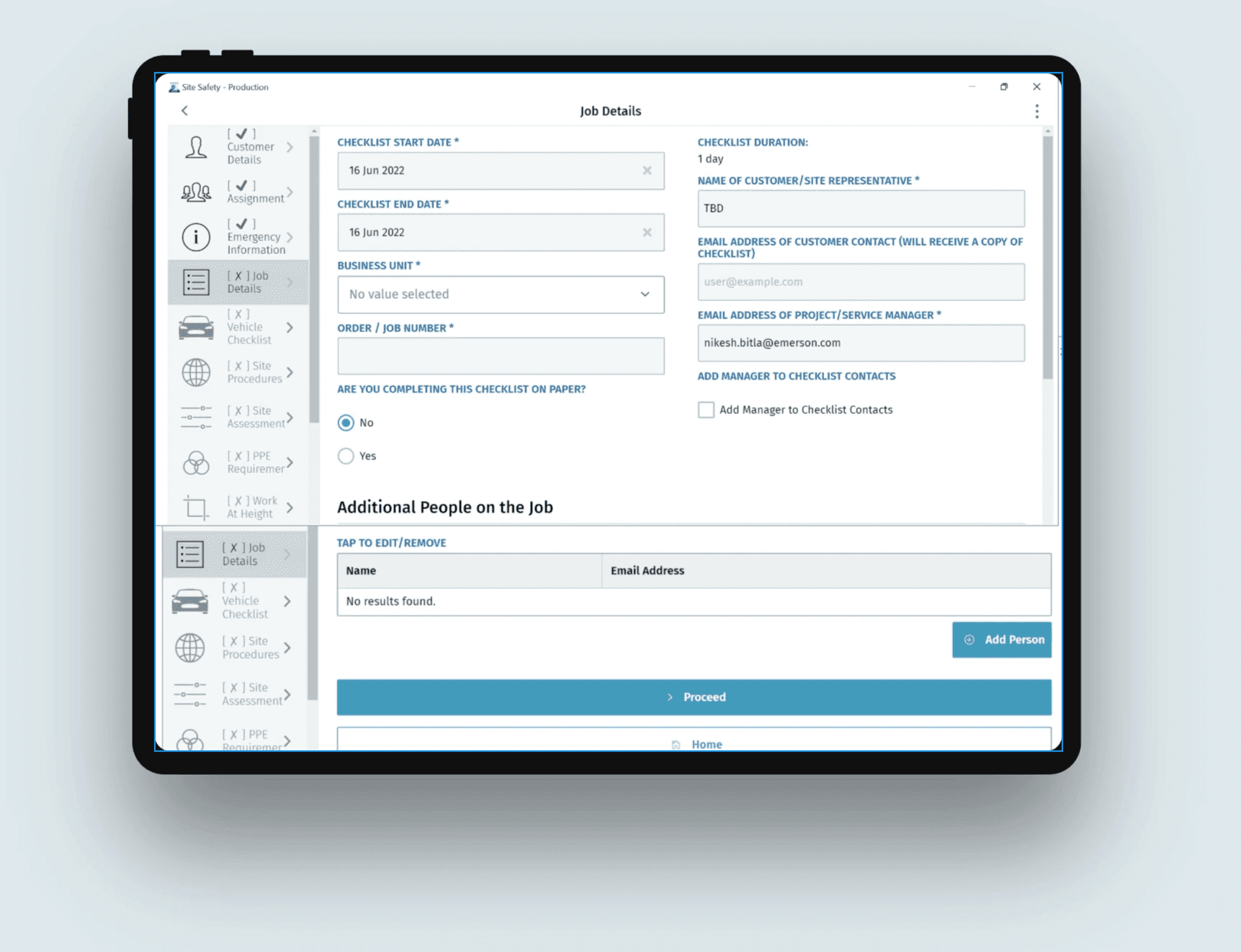
The current Safety App design poses several challenges for users, leading to frustration and inefficiency. Users find it difficult to navigate the app, locate key features, and perform desired actions. The lack of intuitive interface elements and confusing layout hinders the overall user experience. Additionally, slow response times and frequent crashes add to the frustration. Overall, the current design fails to meet user expectations and compromises the effectiveness and usability of the Safety App.
The current Safety App design poses several challenges for users, leading to frustration and inefficiency. Users find it difficult to navigate the app, locate key features, and perform desired actions. The lack of intuitive interface elements and confusing layout hinders the overall user experience. Additionally, slow response times and frequent crashes add to the frustration. Overall, the current design fails to meet user expectations and compromises the effectiveness and usability of the Safety App.

Proposed Solution
Proposed Solution
Proposed Solution
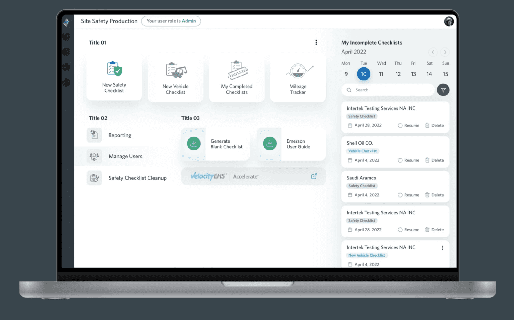
Our Safety App redesign focuses on intuitive navigation, a clean interface, and improved performance. Streamlined navigation and a user-friendly interface will enhance usability, while technical optimizations ensure faster response times. With user feedback guiding the process, our redesign aims to create a user-centric app that maximizes safety and satisfaction.
Our Safety App redesign focuses on intuitive navigation, a clean interface,
and improved performance. Streamlined navigation and a user-friendly interface will enhance usability, while technical optimizations ensure faster response times. With user feedback guiding the process, our redesign aims to create a user-centric app that maximizes safety and satisfaction.
Safety App Dashboard - Option 1
Safety App Dashboard - Option 1
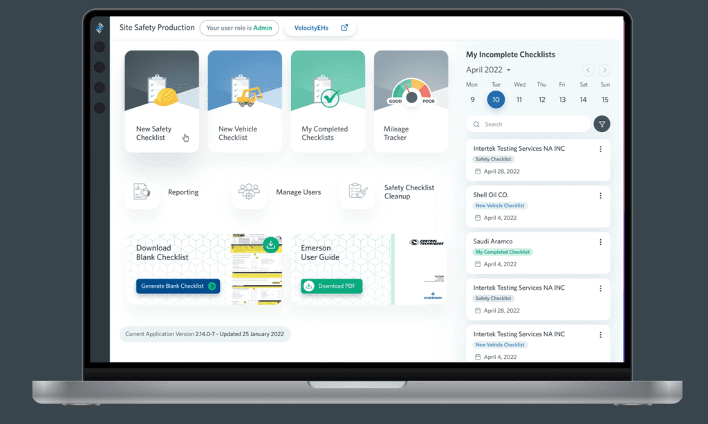


Safety App Dashboard - Option 2
Safety App Dashboard - Option 2


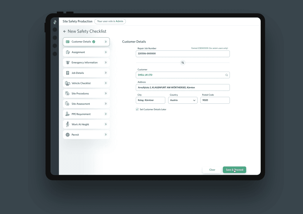
New Safety Checklist
New Safety Checklist
New Safety Checklist: Customer Details
New Safety Checklist: Customer Details


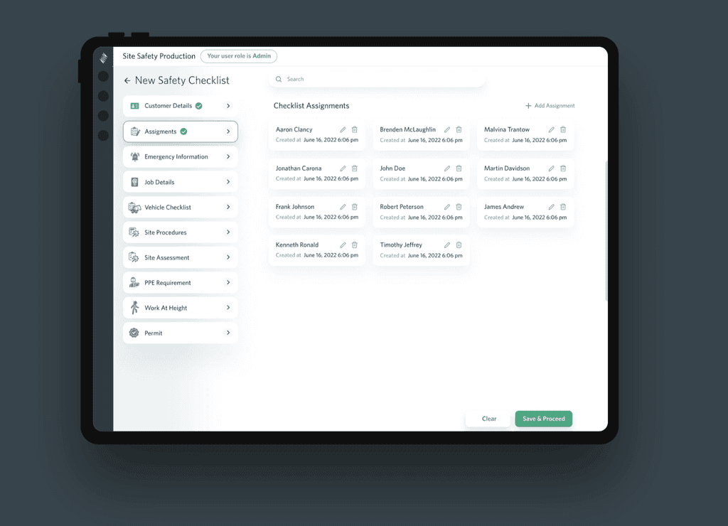
New Safety Checklist: Assignments
New Safety Checklist: Assignments


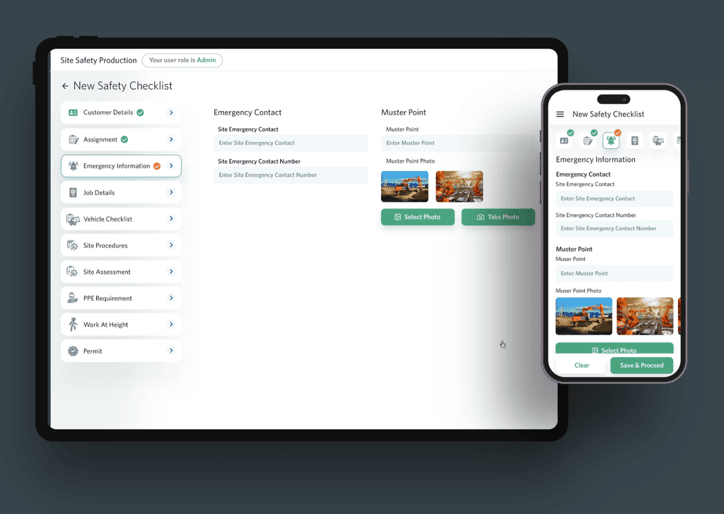
New Safety Checklist: Emergency Info (Responsive)
New Safety Checklist: Emergency Info (Responsive)


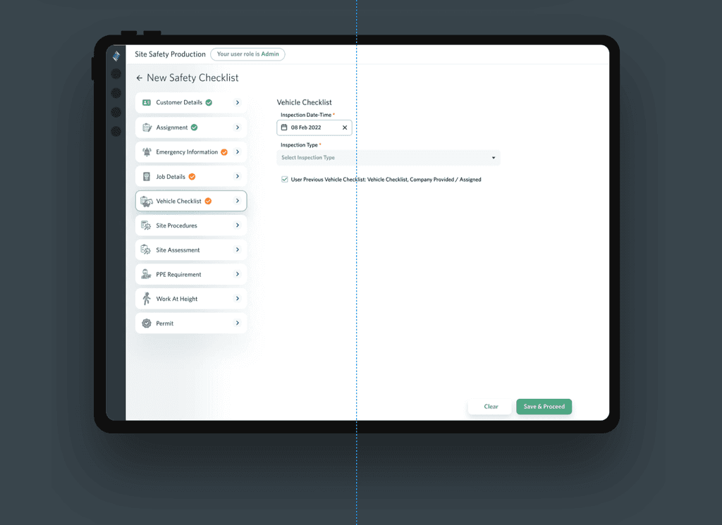
New Safety Checklist: Vehicle Checklist
New Safety Checklist: Vehicle Checklist


Reporting
Reporting
Reporting: Customer Detail - Option 1
Reporting: Customer Detail - Option 1
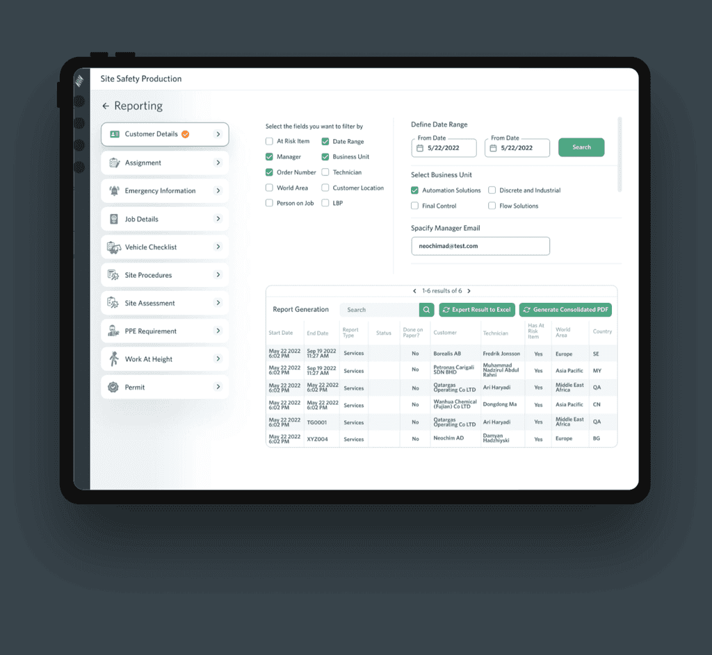


Reporting: Customer Detail - Option 2
Reporting: Customer Detail - Option 2
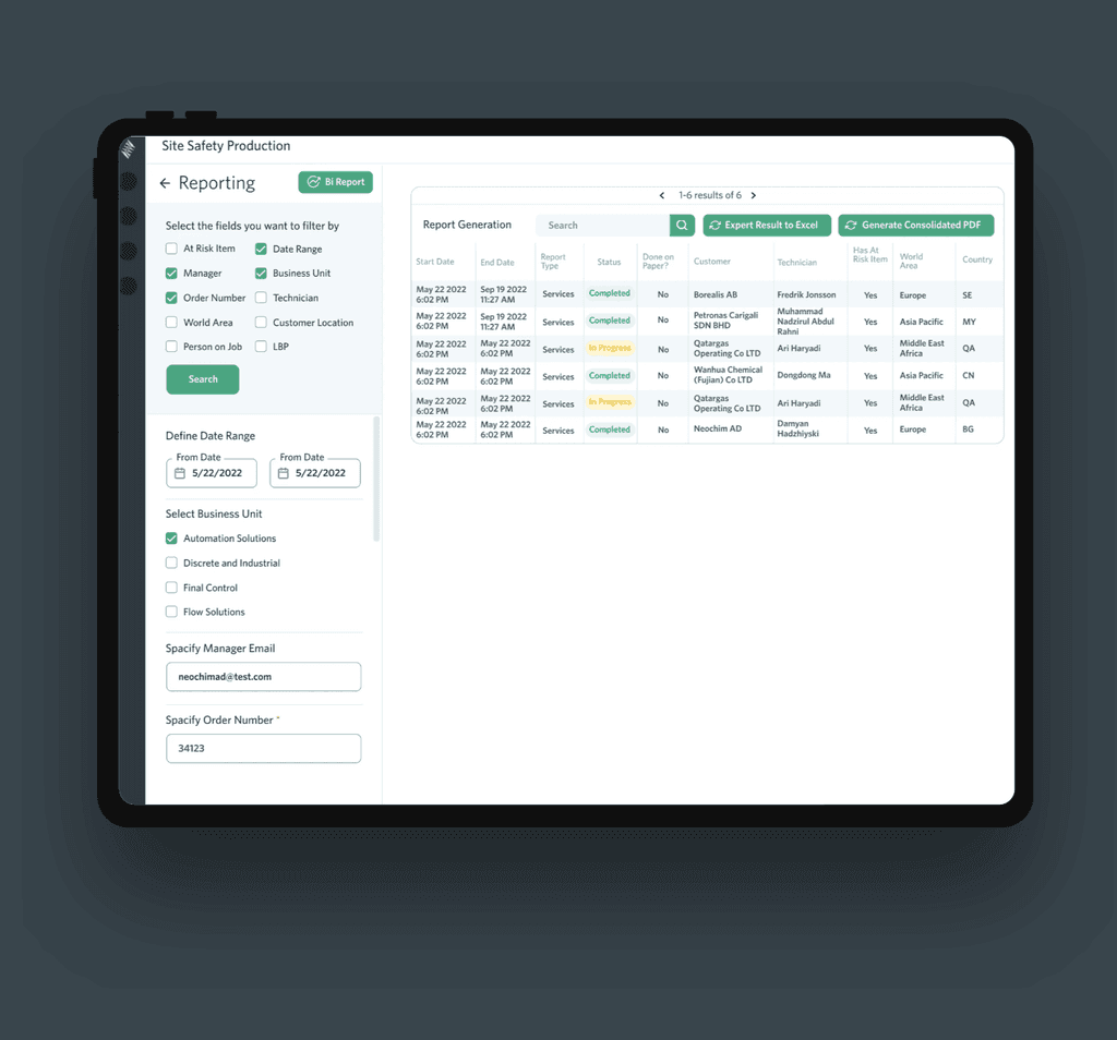


Style Guide
Style Guide
Style Guide
Our style guide ensures a consistent and engaging user experience. It defines design principles, color palette, typography, and UI components. By adhering to the guide, we create a cohesive and visually appealing app that reflects the brand's identity and enhances user satisfaction.
Our style guide ensures a consistent and engaging user experience. It defines design principles, color palette, typography, and UI components. By adhering to the guide, we create a cohesive and visually appealing app that reflects the brand's identity and enhances user satisfaction.
Components UI
Components UI
Components UI
Base Elements: Dropdowns
Base Elements: Dropdowns
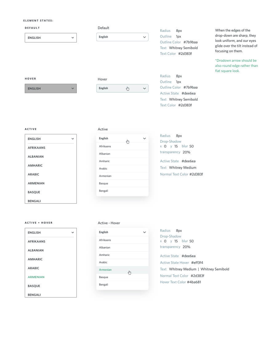


Base Elements: Checkboxes
Base Elements: Checkboxes
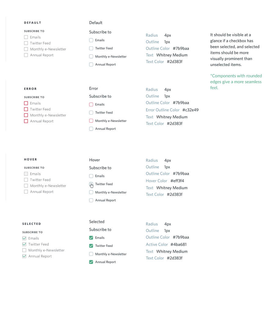


Base Elements: Buttons
Base Elements: Buttons
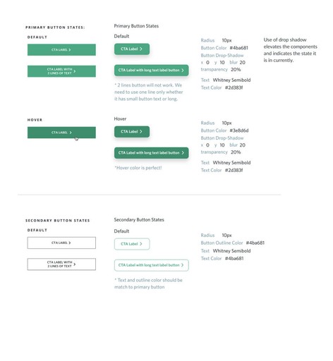


Installation Checklist
Installation Checklist
Search Filter
Search Filter
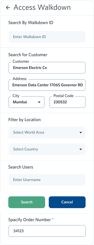

Installation Checklist
Installation Checklist
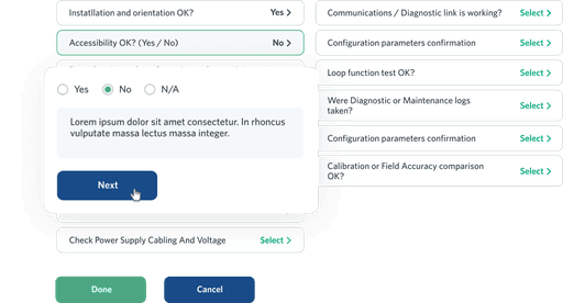


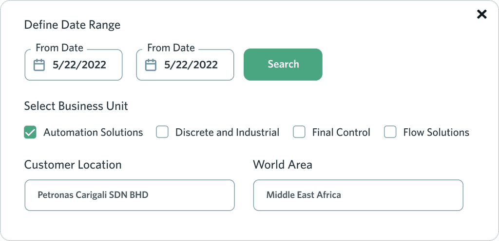
Table Filters + Fields Popup
Table Filters + Fields Popup




Elements: Navigations
Elements: Navigations
Left Navigation
Left Navigation
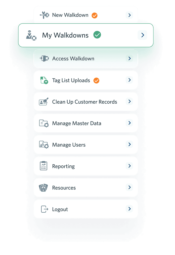


Internal Navigation
Internal Navigation
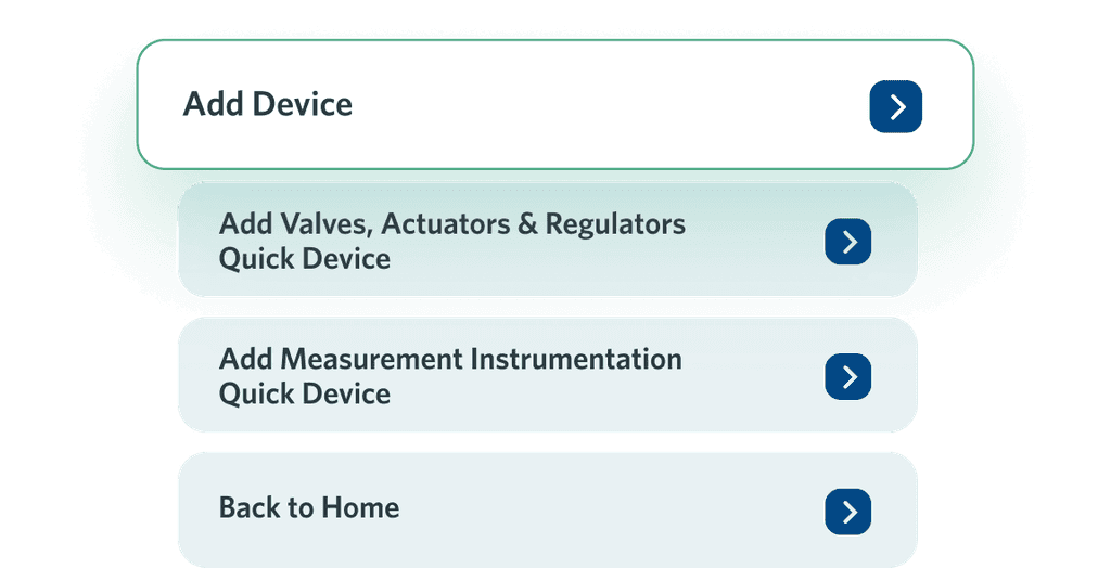


Internal Tabs
Internal Tabs


Sub Tabs
Sub Tabs


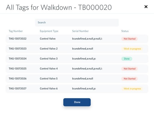
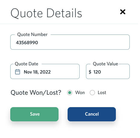
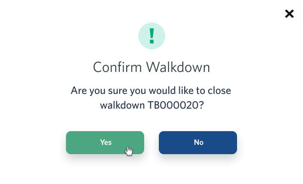
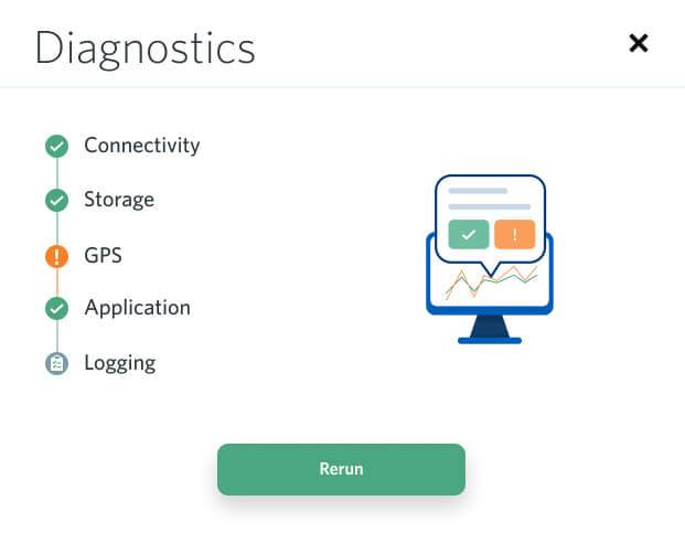
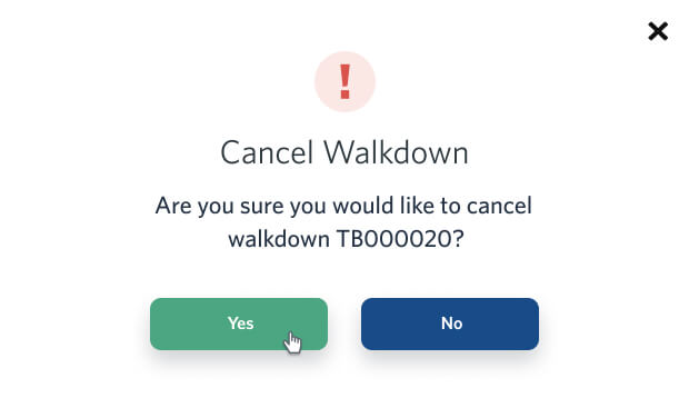
Modal Popup
Modal Popup








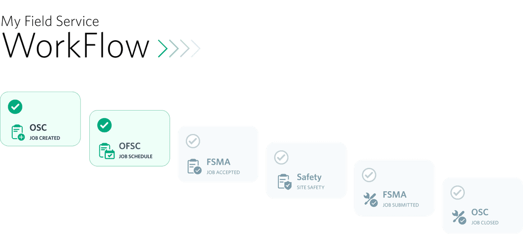


Graphics / Icons
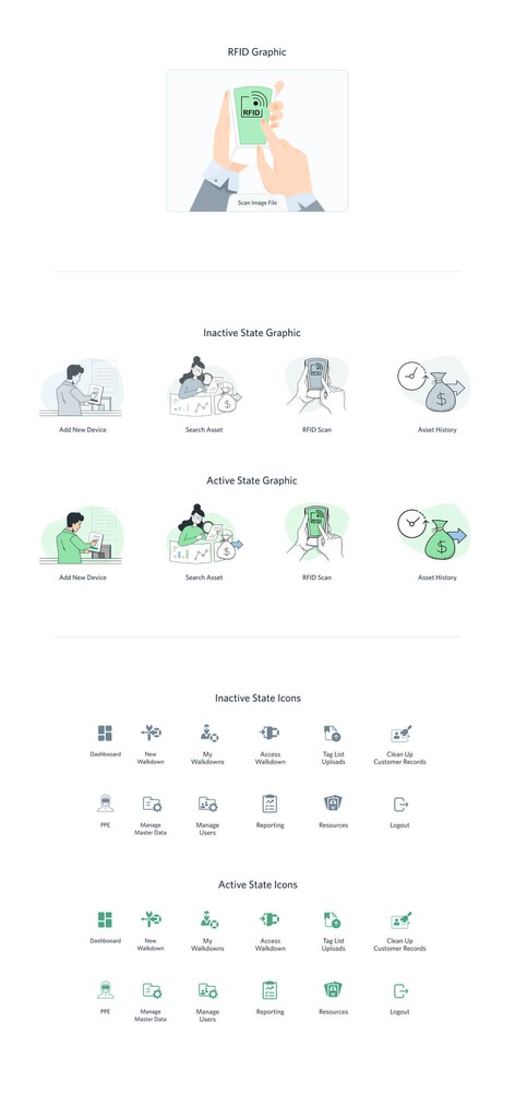
Graphics / Icons
Graphics / Icons


Walkdown App Redesign
Walkdown App Redesign
Walkdown App Redesign
Emerson is the global technology, software and engineering powerhouse driving innovation that makes the world healthier, safer, smarter and more sustainable
Emerson is the global technology, software and engineering powerhouse driving innovation that makes the world healthier, safer, smarter and more sustainable
Skills
Skills
Prototyping
Prototyping
User experience design
User experience design
User Interface Design
User Interface Design
Time
Time
2 Months
2 Months
July 2022
July 2022
Specifications
Specifications
Specifications
Our Walkdown App redesign focuses on enhancing the user experience, improving performance, and adding new features. Key areas of focus include streamlined UI, improved UX, optimized performance, visual design updates, and user testing for continuous improvement.
Our Walkdown App redesign focuses on enhancing the user experience, improving performance, and adding new features. Key areas of focus include streamlined UI, improved UX, optimized performance, visual design updates, and user testing for continuous improvement.


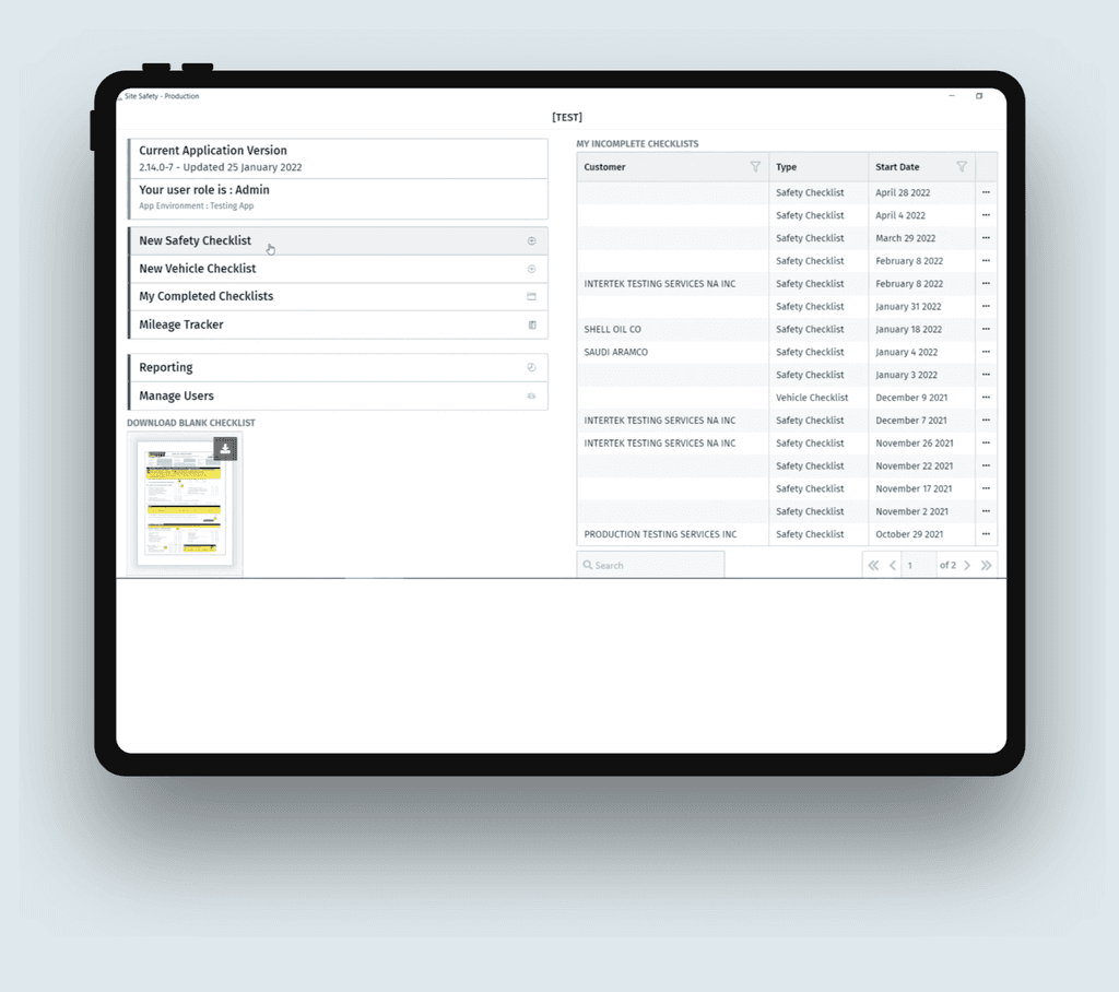
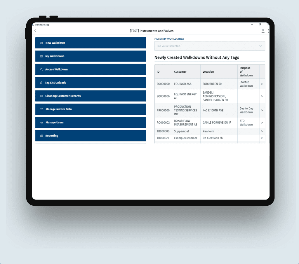
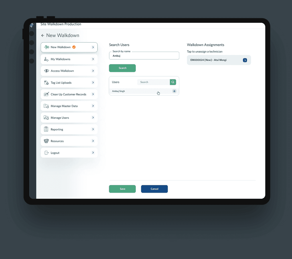
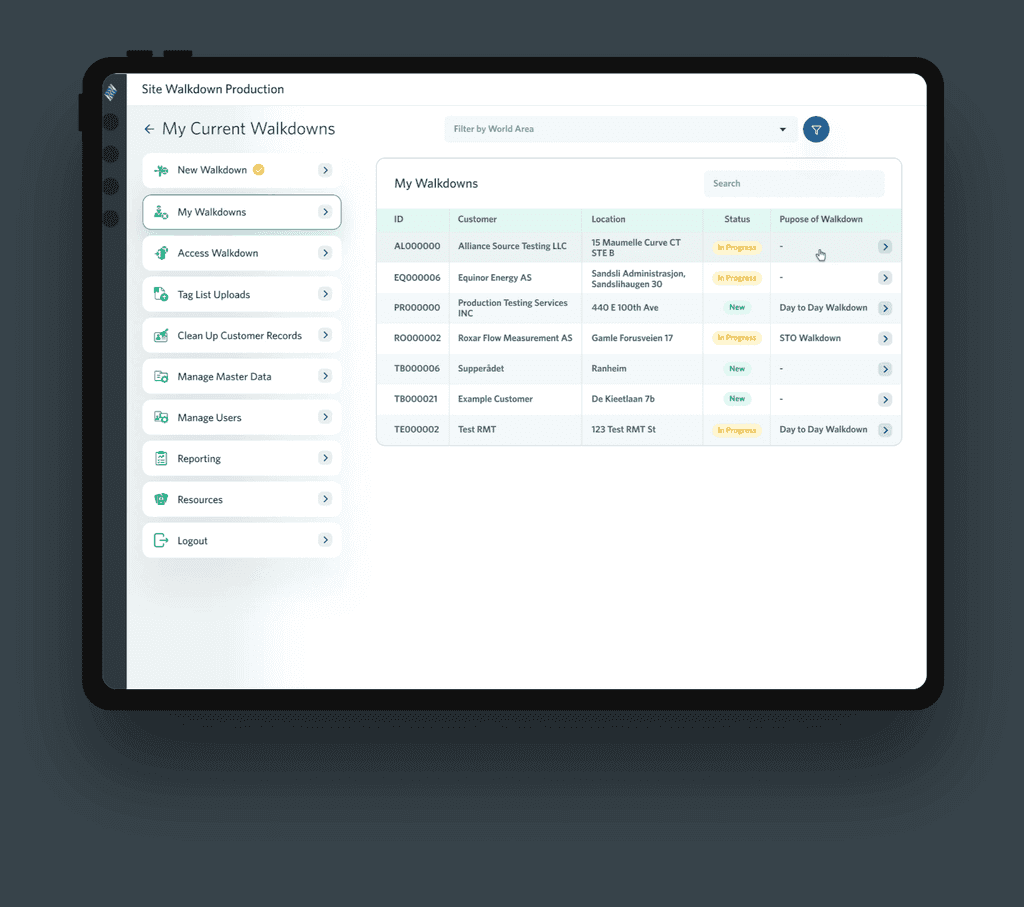
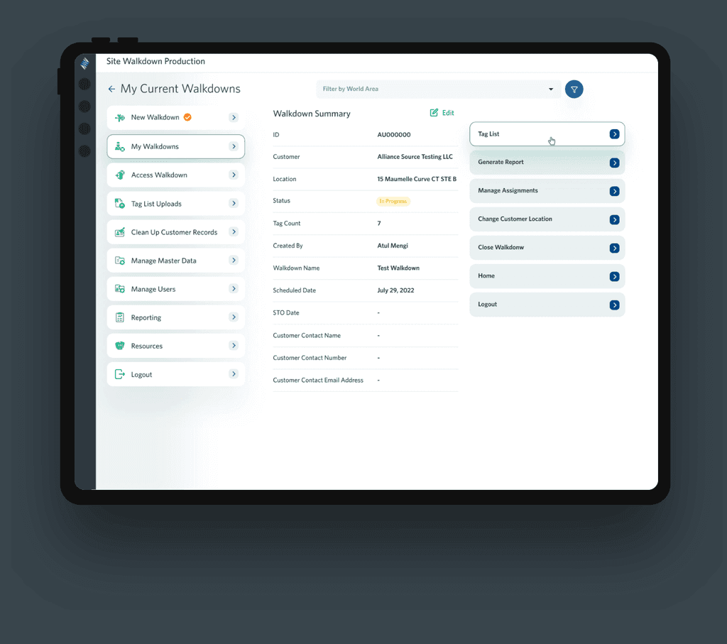
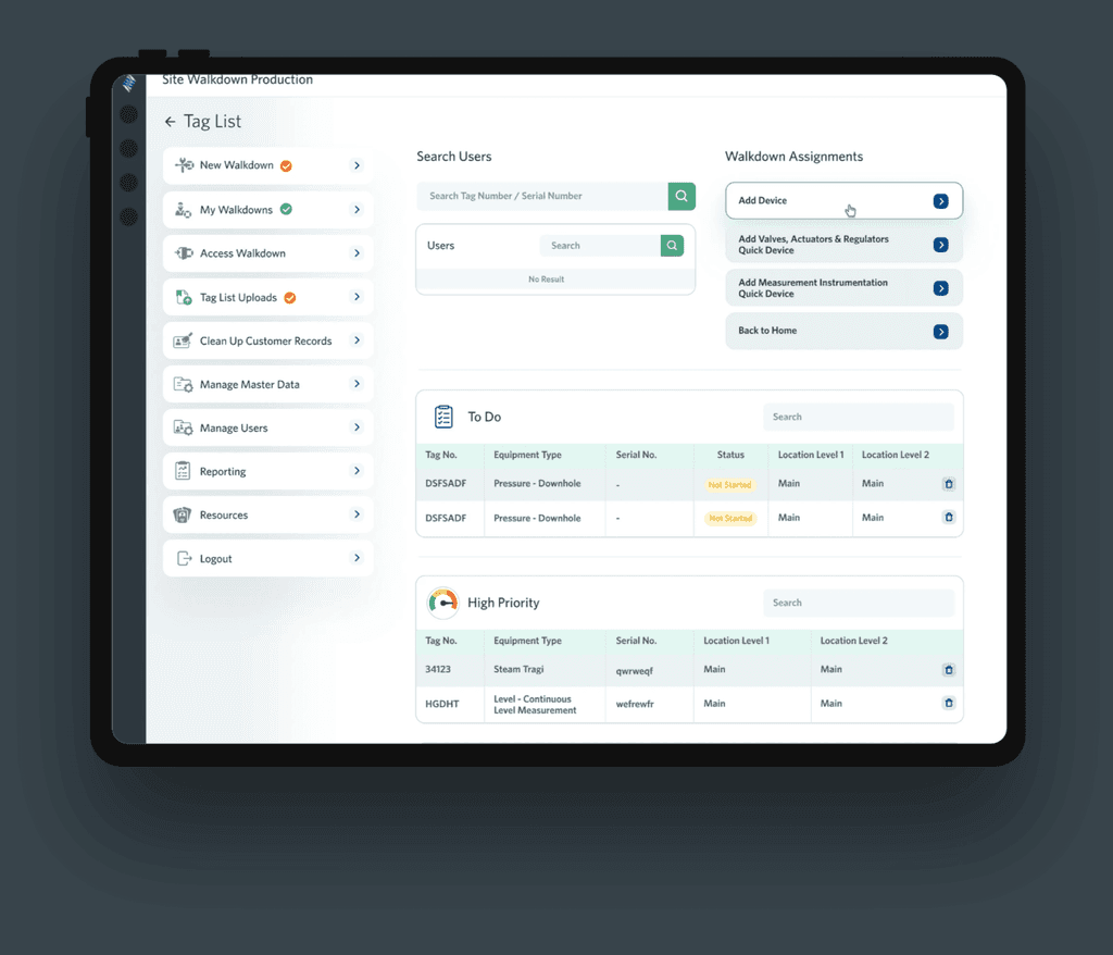
Use Case 1: Navigation + Table Grid
Use Case 1: Navigation + Table Grid
Use Case 1: Navigation + Table Grid
Pain Points
Pain Points
Pain Points
The current Walkdown App's navigation and table grid functionalities pose challenges for users, leading to frustration and inefficiency. Users find it difficult to navigate through the app, locate specific information within the table grids, and perform desired actions. The lack of intuitive navigation elements and complex table grid interactions hinder the overall user experience, impacting productivity and effectiveness.
The current Walkdown App's navigation and table grid functionalities pose challenges for users, leading to frustration and inefficiency. Users find it difficult to navigate through the app, locate specific information within the table grids, and perform desired actions. The lack of intuitive navigation elements and complex table grid interactions hinder the overall user experience, impacting productivity and effectiveness.


Proposed Solution
Proposed Solution
Proposed Solution
To improve the Walkdown App's navigation and table grid functionalities, we will streamline navigation, enhance table grid interactions, optimize the user interface, and gather user feedback for continuous improvement. This will result in a more intuitive and user-friendly experience, increasing productivity and satisfaction.
To improve the Walkdown App's navigation and table grid functionalities, we will streamline navigation, enhance table grid interactions, optimize the user interface, and gather user feedback for continuous improvement. This will result in a more intuitive and user-friendly experience, increasing productivity and satisfaction.
Use Case 2: Scanning and Add Device
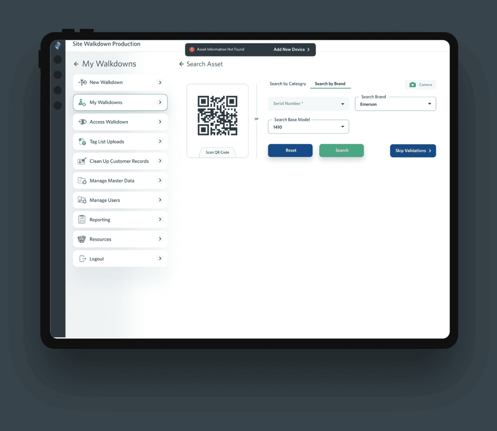
Use Case 2: Scanning and Add Device
Use Case 2: Scanning and Add Device
Pain Points
Pain Points
Pain Points
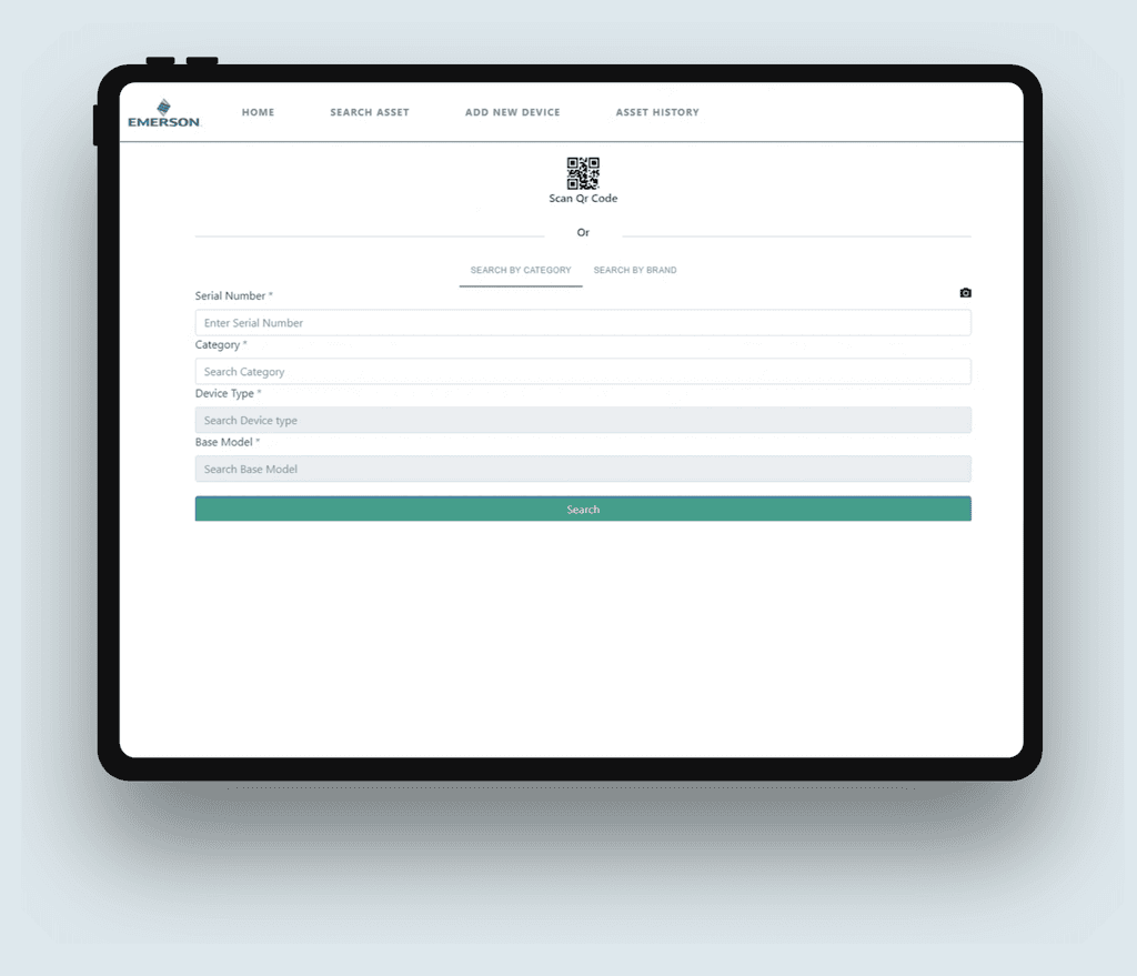
Users encounter difficulties when scanning and adding devices in the current Walkdown App, leading to frustration and inefficiency. The process of scanning devices is cumbersome, and users struggle to properly add and configure devices within the app. This lack of intuitive scanning and device management features hampers the overall user experience and impacts the app's effectiveness in managing devices.
Users encounter difficulties when scanning and adding devices in the current Walkdown App, leading to frustration and inefficiency. The process of scanning devices is cumbersome, and users struggle to properly add and configure devices within the app. This lack of intuitive scanning and device management features hampers the overall user experience and impacts the app's effectiveness in managing devices.

Proposed Solution
Proposed Solution
Proposed Solution
To enhance the Walkdown App's scanning and device adding process, we will simplify device scanning, streamline device adding and configuration, optimize the user interface, and gather user feedback for continuous improvement. These solutions will improve the user experience, making device management easier and more efficient.
To enhance the Walkdown App's scanning and device adding process, we will simplify device scanning, streamline device adding and configuration, optimize the user interface, and gather user feedback for continuous improvement. These solutions will improve the user experience, making device management easier and more efficient.
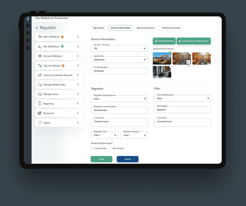
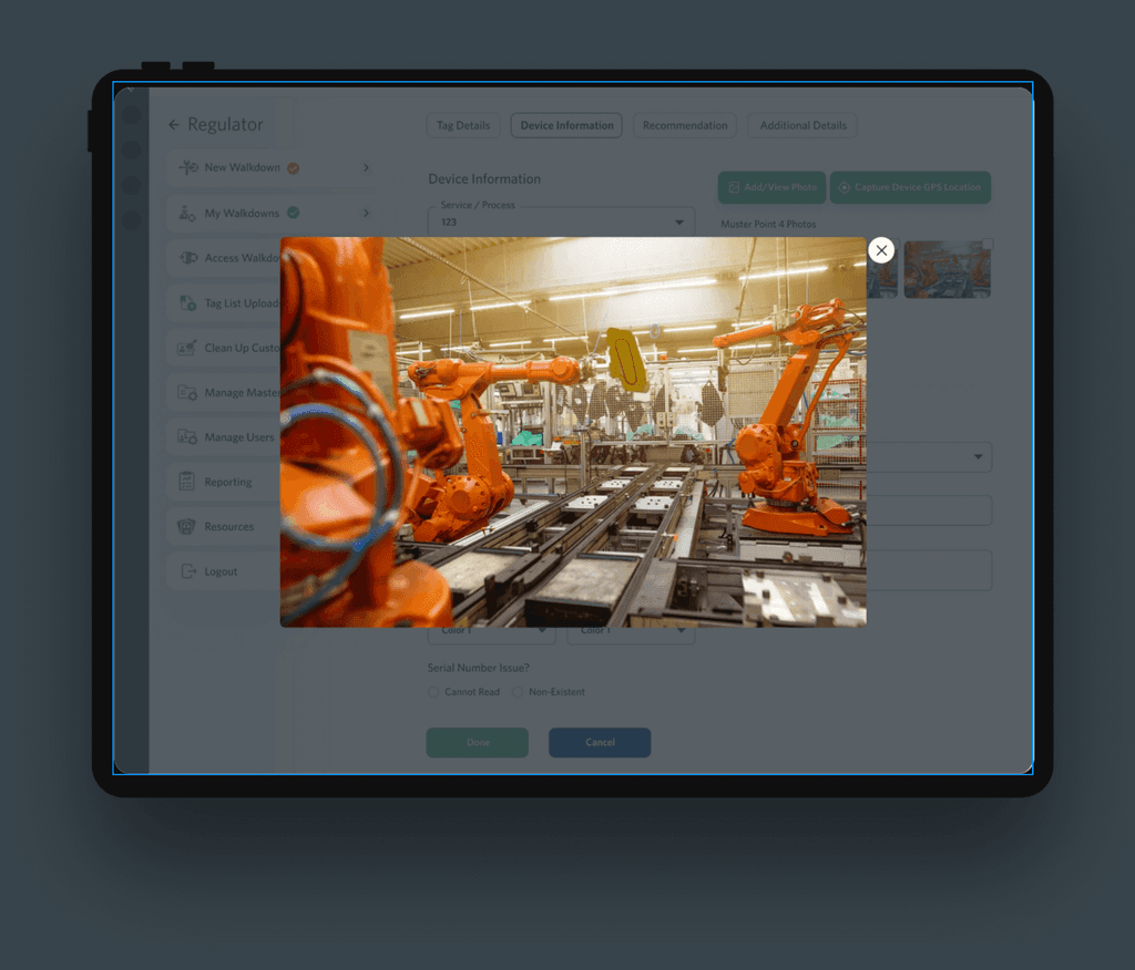
Use Case 3: Add/View Photos
Use Case 3: Add/View Photos
Use Case 3: Add/View Photos
Pain Points
Pain Points
Pain Points
Users face challenges when adding and viewing photos in the current Walkdown App, leading to frustration and a lack of efficient photo management. Users find it difficult to add photos to specific locations or items, and accessing and organizing photos within the app is cumbersome. This lack of intuitive photo management features hampers the overall user experience and makes it challenging to effectively capture and reference visual information.
Users face challenges when adding and viewing photos in the current Walkdown App, leading to frustration and a lack of efficient photo management. Users find it difficult to add photos to specific locations or items, and accessing and organizing photos within the app is cumbersome. This lack of intuitive photo management features hampers the overall user experience and makes it challenging to effectively capture and reference visual information.
Proposed Solution
Proposed Solution
Proposed Solution
To enhance the Walkdown App's photo management, we will simplify photo uploading, improve photo organization and viewing, optimize the user interface, and gather user feedback for continuous improvement. These solutions will improve the user experience, making it easier to add, organize, and access photos within the app.
To enhance the Walkdown App's photo management, we will simplify photo uploading, improve photo organization and viewing, optimize the user interface, and gather user feedback for continuous improvement. These solutions will improve the user experience, making it easier to add, organize, and access photos within the app.
CX Service Portal Redesign
CX Service Portal Redesign
CX Service Portal Redesign
Emerson is the global technology, software and engineering powerhouse driving innovation that makes the world healthier, safer, smarter and more sustainable
Emerson is the global technology, software and engineering powerhouse driving innovation that makes the world healthier, safer, smarter and more sustainable
Skills
Skills
Prototyping
Prototyping
User experience design
User experience design
User Interface Design
User Interface Design
Time
Time
3 Weeks
3 Weeks
July 2022
July 2022
Specifications
Specifications
Specifications
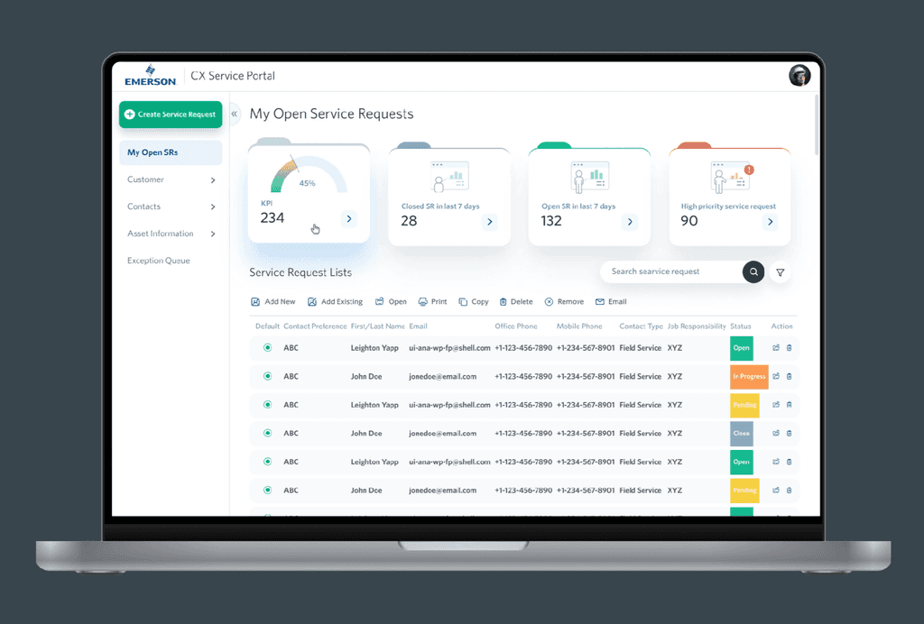
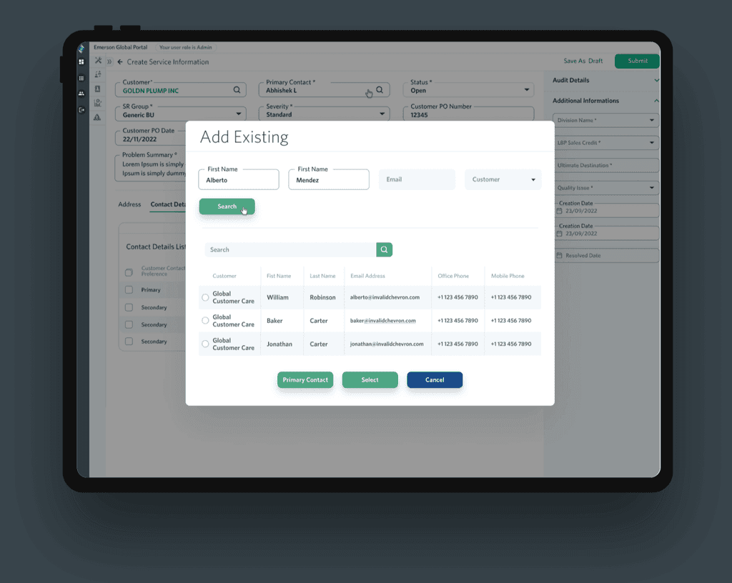
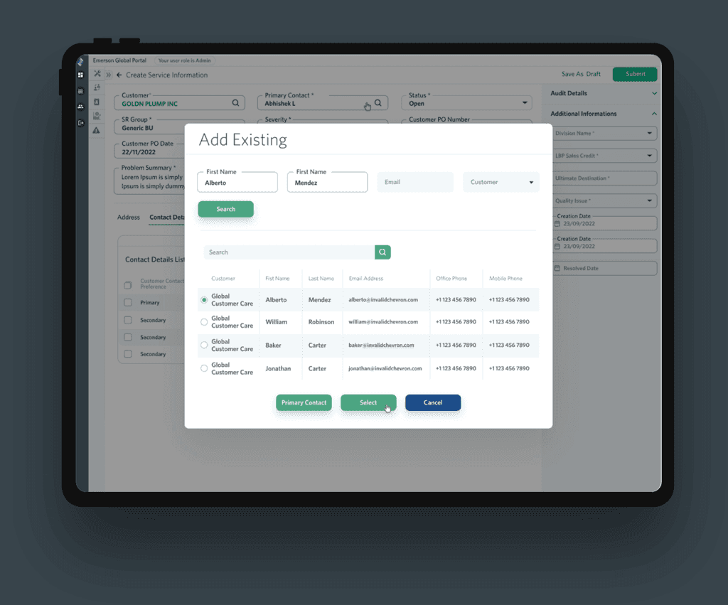
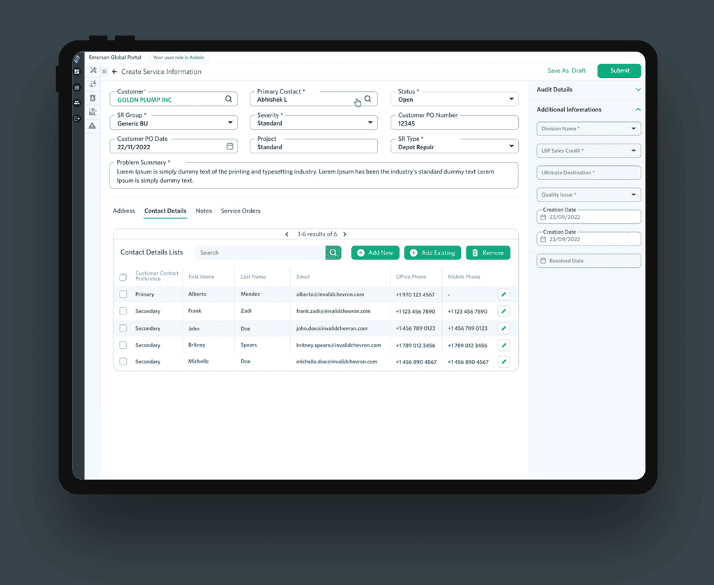
Our CX Service Request App redesign focuses on improving the user experience and functionality. Key areas of focus include streamlined UI, enhanced UX, simplified service request process, backend system integration, updated visual design, and user testing for continuous improvement.
Our CX Service Request App redesign focuses on improving the user experience and functionality. Key areas of focus include streamlined UI, enhanced UX, simplified service request process, backend system integration, updated visual design, and user testing for continuous improvement.
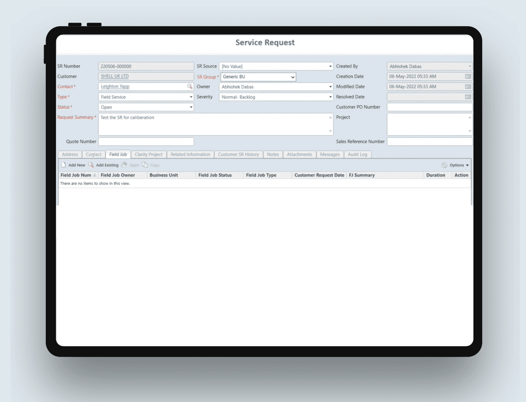
Pain Points
Pain Points
Pain Points
Users of the CX Service Request App currently face challenges that result in frustration and inefficiency. The app lacks intuitive navigation and a user-friendly interface, making it difficult for users to locate and submit service requests. Users struggle to find the relevant information and encounter delays in receiving updates on their requests. These pain points negatively impact the overall user experience and hinder effective communication between users and the service team.
Users of the CX Service Request App currently face challenges that result in frustration and inefficiency. The app lacks intuitive navigation and a user-friendly interface, making it difficult for users to locate and submit service requests. Users struggle to find the relevant information and encounter delays in receiving updates on their requests. These pain points negatively impact the overall user experience and hinder effective communication between users and the service team.

Proposed Solution
Proposed Solution
Proposed Solution
Our solution for the CX Service Request App focuses on intuitive navigation, user-friendly interface, efficient service request submission, effective communication, integration with backend systems, and user testing for continuous improvement. These enhancements will improve the user experience, streamline the request process, and enhance customer satisfaction.
Our solution for the CX Service Request App focuses on intuitive navigation, user-friendly interface, efficient service request submission, effective communication, integration with backend systems, and user testing for continuous improvement. These enhancements will improve the user experience, streamline the request process, and enhance customer satisfaction.

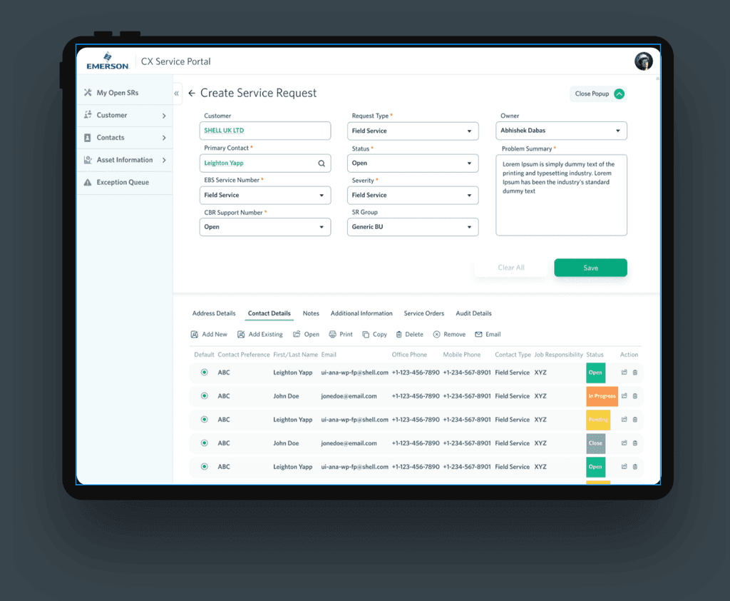


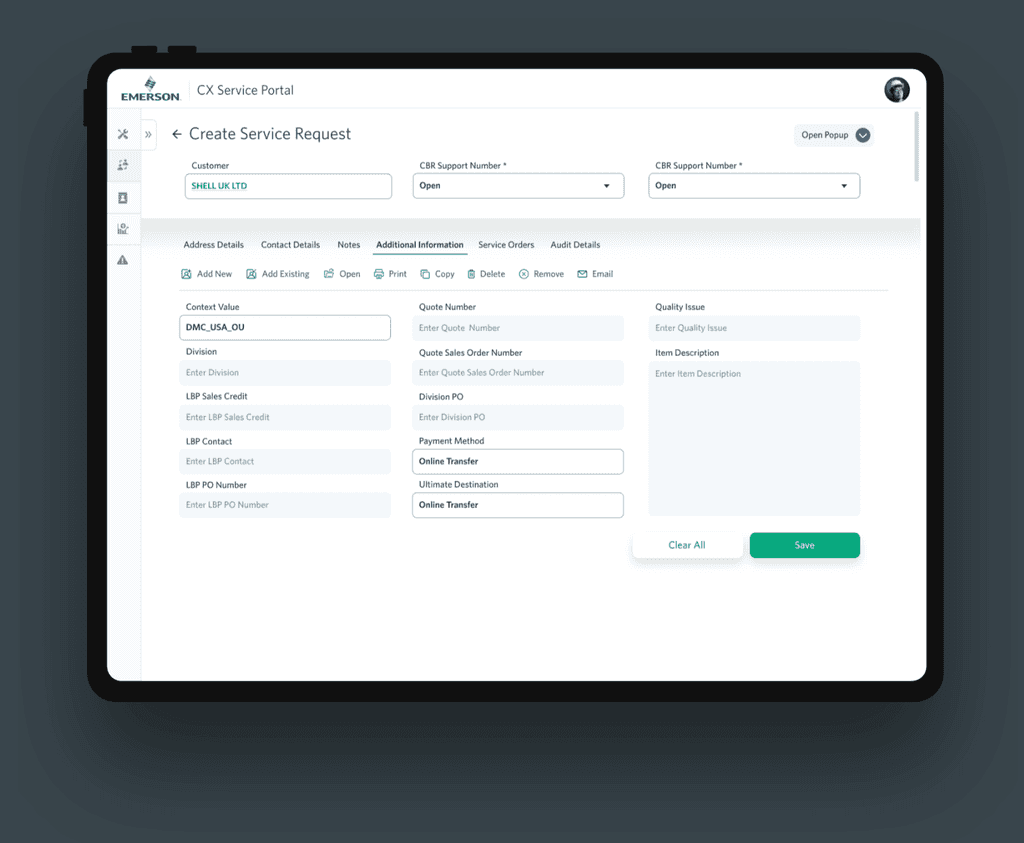

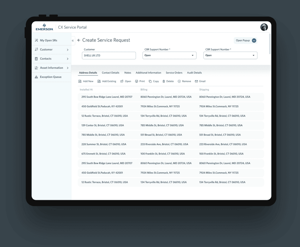

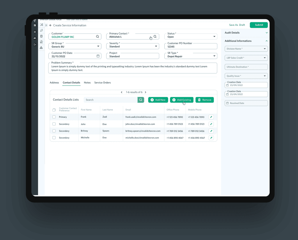
Add Existing: Contact Details
Add Existing: Contact Details




Use Case 1: Filtering
Use Case 1: Filtering
Use Case 1: Filtering
Pain Points
Pain Points
Pain Points
Users of the CX Service Request App encounter difficulties when filtering service requests, leading to frustration and inefficiency. The current filtering functionality lacks flexibility and precision, making it challenging for users to narrow down their search results to find the specific requests they need. The lack of intuitive filtering options and limited customization options hinder the overall user experience and impact users' ability to efficiently manage and address service requests.
Users of the CX Service Request App encounter difficulties when filtering service requests, leading to frustration and inefficiency. The current filtering functionality lacks flexibility and precision, making it challenging for users to narrow down their search results to find the specific requests they need. The lack of intuitive filtering options and limited customization options hinder the overall user experience and impact users' ability to efficiently manage and address service requests.


Proposed Solution
Proposed Solution
Proposed Solution
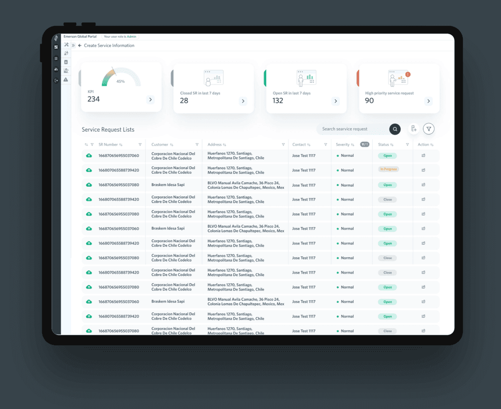
To improve filtering in the CX Service Request App, we will enhance filtering options, allow customization and saved filters, create an intuitive interface, optimize performance, and gather user feedback for continuous improvement. This will enhance the user experience, making it easier for users to find and manage service requests efficiently.
To improve filtering in the CX Service Request App, we will enhance filtering options, allow customization and saved filters, create an intuitive interface, optimize performance, and gather user feedback for continuous improvement. This will enhance the user experience, making it easier for users to find and manage service requests efficiently.
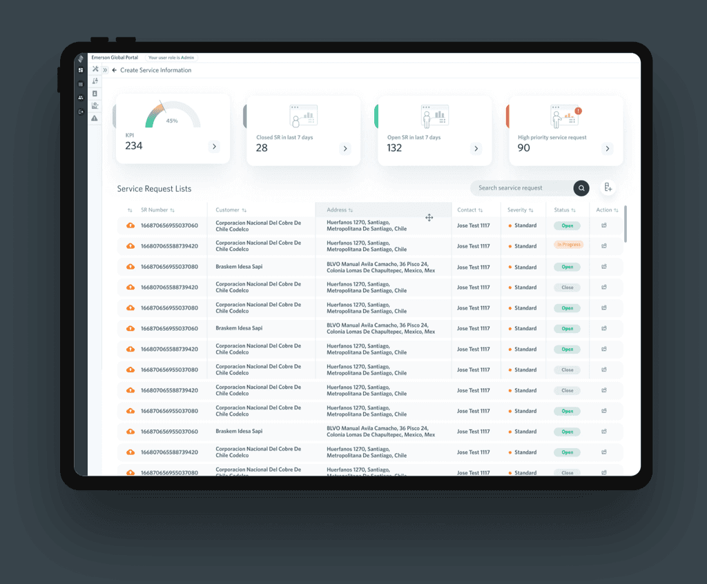
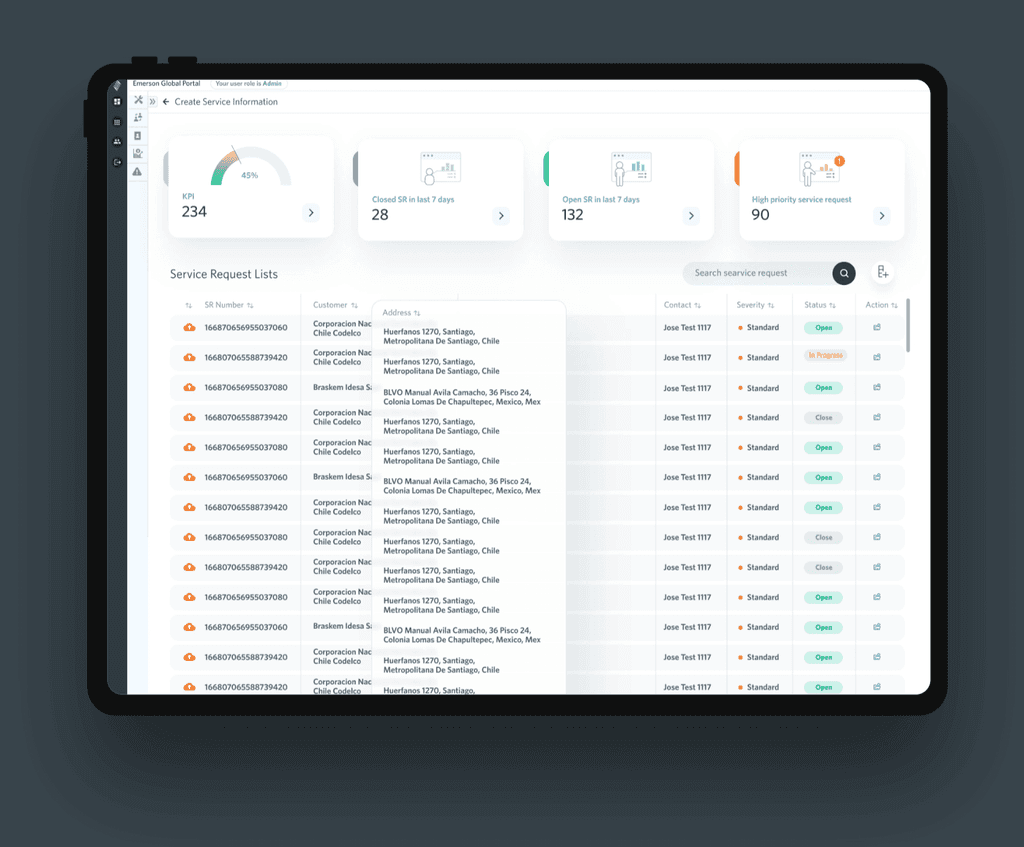
Use Case 2: Movable Column
Use Case 2: Movable Column
Use Case 2: Movable Column
Pain Points
Pain Points
Pain Points
Users of the CX Service Request App encounter challenges when trying to customize and rearrange table grid columns, resulting in frustration and inefficiency. The current app lacks the ability to move or rearrange columns within the table grid view, limiting users' ability to customize their view based on their specific needs. This lack of flexibility hampers the user experience, making it difficult for users to prioritize and visualize the information that is most relevant to them.
Users of the CX Service Request App encounter challenges when trying to customize and rearrange table grid columns, resulting in frustration and inefficiency. The current app lacks the ability to move or rearrange columns within the table grid view, limiting users' ability to customize their view based on their specific needs. This lack of flexibility hampers the user experience, making it difficult for users to prioritize and visualize the information that is most relevant to them.
Proposed Solution
Proposed Solution
Proposed Solution
To improve movable table grid columns in the CX Service Request App, we will enable column customization, implement a persistent layout, ensure responsive design, create a user-friendly interface, and gather user feedback for continuous improvement. This will enhance the user experience, allowing users to customize their view and prioritize information effectively.
To improve movable table grid columns in the CX Service Request App, we will enable column customization, implement a persistent layout, ensure responsive design, create a user-friendly interface, and gather user feedback for continuous improvement. This will enhance the user experience, allowing users to customize their view and prioritize information effectively.
Use Case 3: Create Job
Use Case 3: Create Job
Use Case 3: Create Job
Pain Points
Pain Points
Pain Points
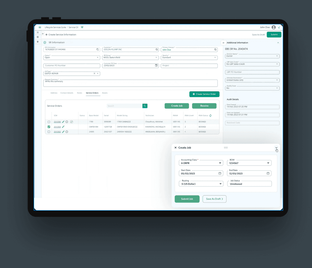
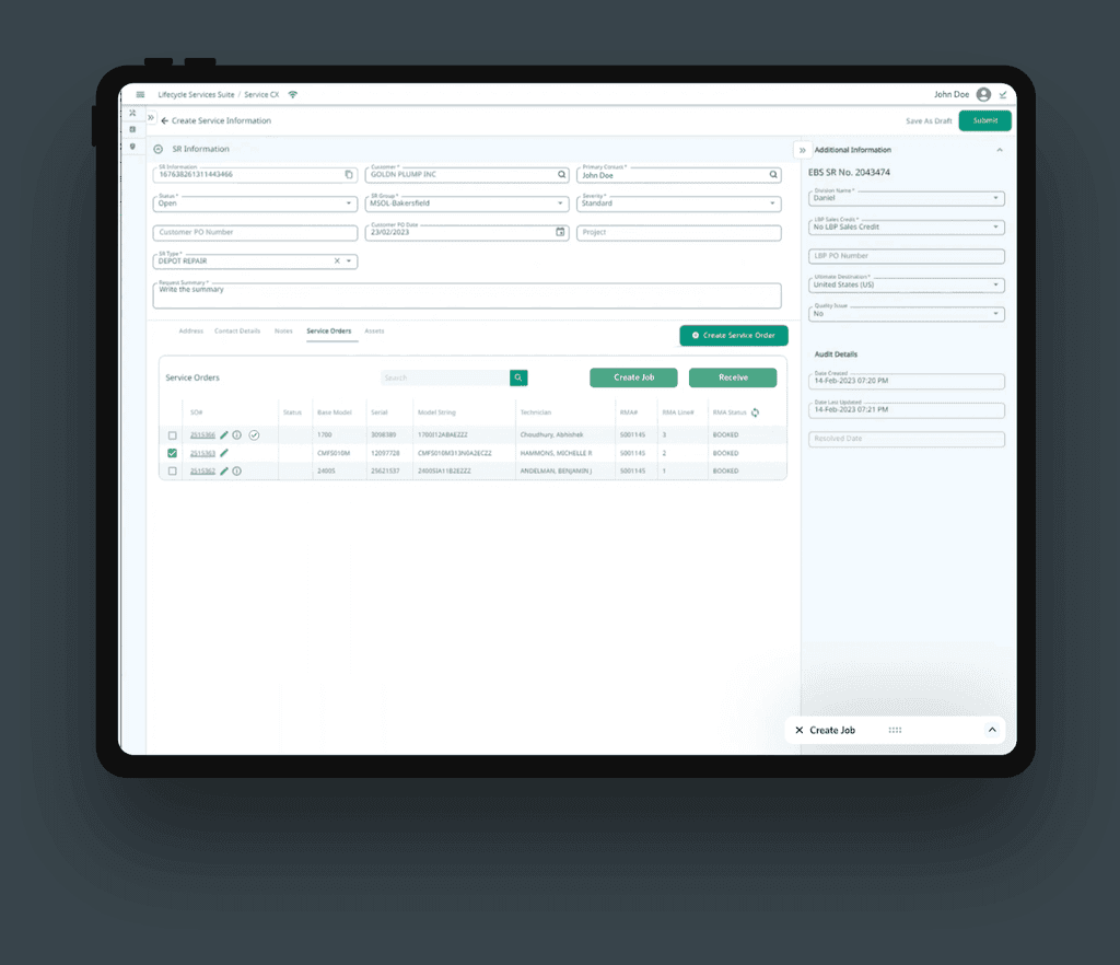
Engineers and machinery workers using the CX Service Request App encounter challenges when trying to create machine job requests, leading to frustration and inefficiency. The current process for creating machine job requests lacks user-friendly features and fails to provide necessary information for effective communication between engineers and machinery workers. Users struggle to accurately describe the job requirements and specifications, resulting in delays, misunderstandings, and potential errors in the maintenance or repair process.
Engineers and machinery workers using the CX Service Request App encounter challenges when trying to create machine job requests, leading to frustration and inefficiency. The current process for creating machine job requests lacks user-friendly features and fails to provide necessary information for effective communication between engineers and machinery workers. Users struggle to accurately describe the job requirements and specifications, resulting in delays, misunderstandings, and potential errors in the maintenance or repair process.
Proposed Solution
Proposed Solution
Proposed Solution
To enhance the creation of machine job requests in the CX Service Request App, we will provide clear job description fields, enable visual documentation attachments, facilitate collaboration features, offer notification and status updates, design a user-friendly interface, and gather user feedback for continuous improvement. This will improve the user experience, streamline communication between engineers and machinery workers, and enhance overall efficiency.
To enhance the creation of machine job requests in the CX Service Request App, we will provide clear job description fields, enable visual documentation attachments, facilitate collaboration features, offer notification and status updates, design a user-friendly interface, and gather user feedback for continuous improvement. This will improve the user experience, streamline communication between engineers and machinery workers, and enhance overall efficiency.
Global Portal Redesign
Global Portal Redesign
Global Portal Redesign
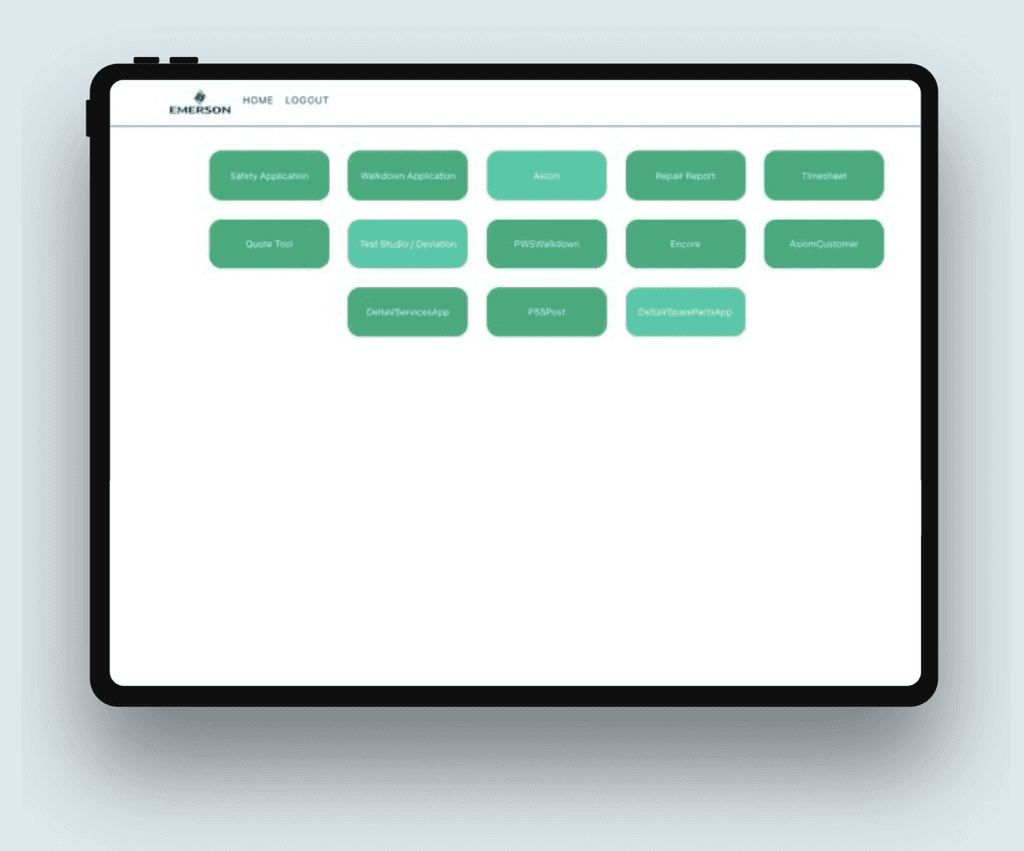
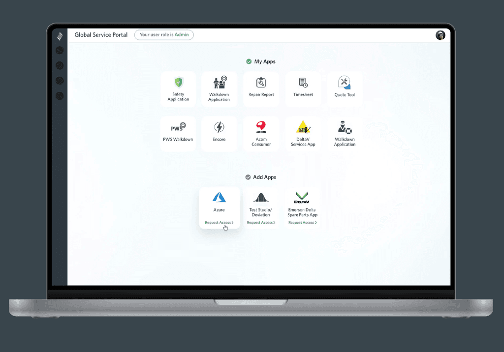
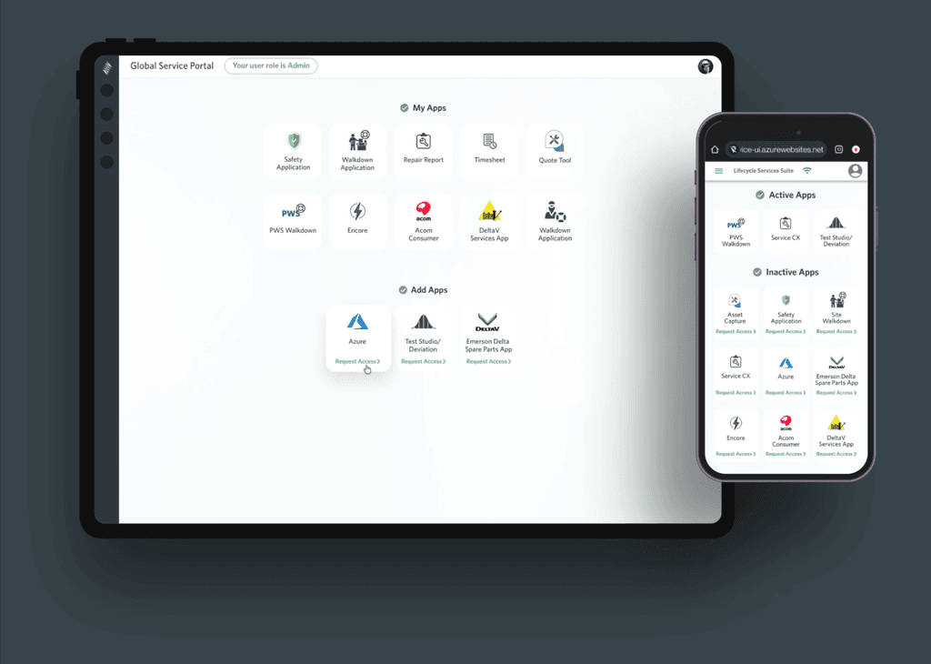
Our redesign of the Global Portal App's Infernal Apps page focuses on enhancing the user experience and visual appeal. The Infernal Apps page showcases a collection of powerful and innovative applications for global management. Through a streamlined and intuitive interface, users can easily discover and access these apps, empowering them to effectively manage global operations. The redesign includes improved navigation, visual enhancements, and a user-friendly layout to optimize the overall user experience and support seamless app exploration and utilization.
Our redesign of the Global Portal App's Infernal Apps page focuses on enhancing the user experience and visual appeal. The Infernal Apps page showcases a collection of powerful and innovative applications for global management. Through a streamlined and intuitive interface, users can easily discover and access these apps, empowering them to effectively manage global operations. The redesign includes improved navigation, visual enhancements, and a user-friendly layout to optimize the overall user experience and support seamless app exploration and utilization.
Pain Points
Pain Points
Pain Points
Users of the Global Portal App's Infernal Apps page face challenges, such as difficulties in finding and accessing relevant global management applications. The current page lacks intuitive navigation and a user-friendly layout, making it challenging for users to explore and utilize the available apps effectively. This hampers the user experience and limits the potential for efficient global operations management.
Users of the Global Portal App's Infernal Apps page face challenges, such as difficulties in finding and accessing relevant global management applications. The current page lacks intuitive navigation and a user-friendly layout, making it challenging for users to explore and utilize the available apps effectively. This hampers the user experience and limits the potential for efficient global operations management.

Proposed Solution
Proposed Solution
Proposed Solution
Our proposed solution for the Global Portal App's Infernal Apps page focuses on improving navigation, enhancing the user interface, and optimizing the layout to facilitate easy app discovery and utilization. By creating a user-friendly experience, we aim to enhance the efficiency and effectiveness of global operations management for users.
Our proposed solution for the Global Portal App's Infernal Apps page focuses on improving navigation, enhancing the user interface, and optimizing the layout to facilitate easy app discovery and utilization. By creating a user-friendly experience, we aim to enhance the efficiency and effectiveness of global operations management for users.




My Assets Landingpage Redesign
My Assets Landingpage Redesign
My Assets Landingpage Redesign
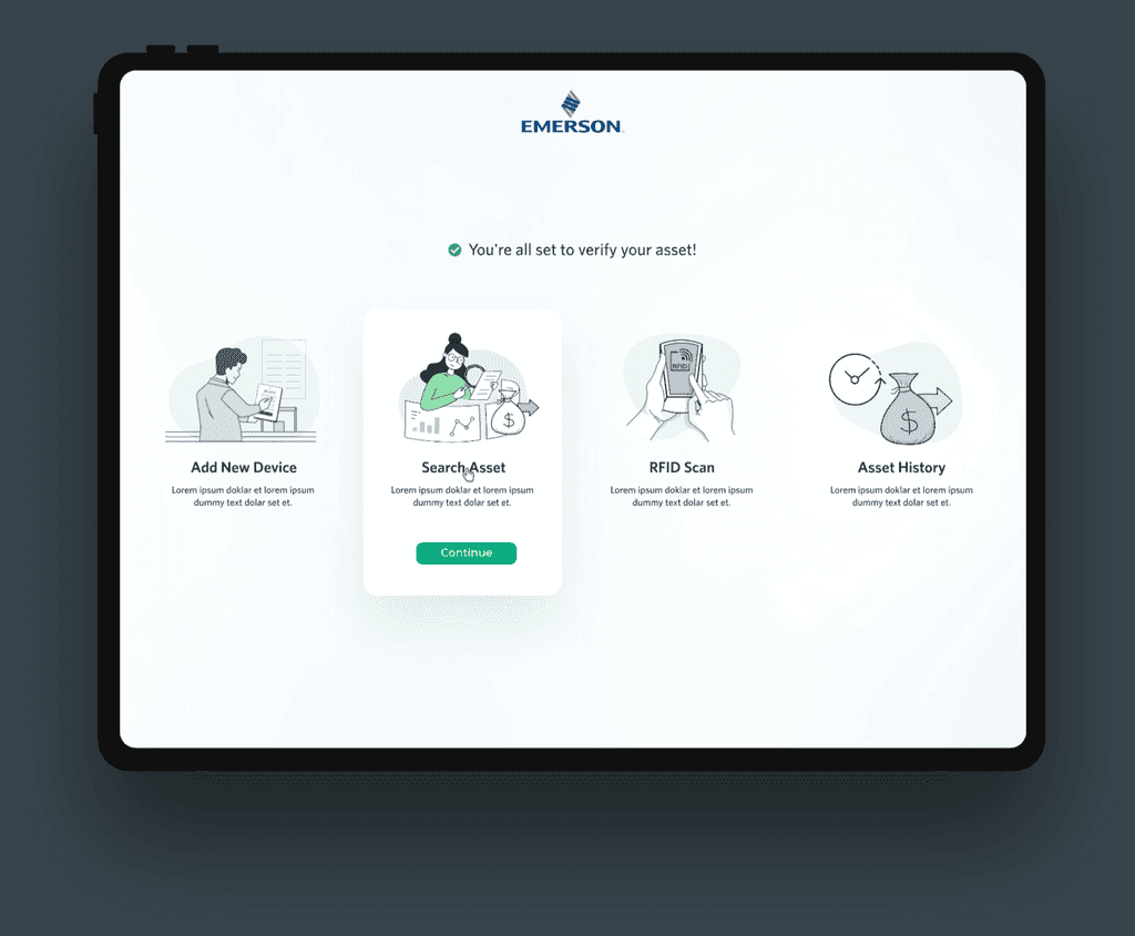
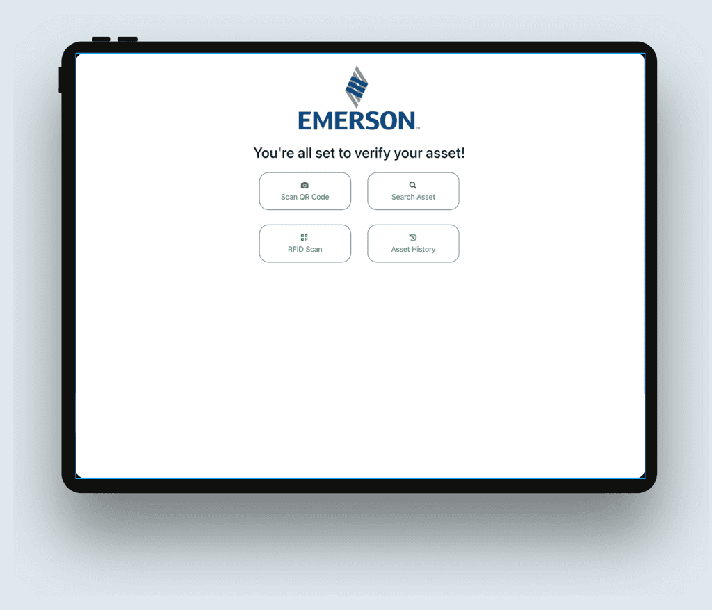
My Assets Main Landing page serves as the central hub for users to access and manage their assets efficiently. With a user-friendly interface and intuitive navigation, users can easily view and organize their assets, access relevant documentation, and monitor asset performance. The page provides a comprehensive overview of asset information and enables users to take proactive actions for maintenance and optimization. Through a streamlined and organized layout, users can maximize the value and performance of their assets with ease.
My Assets Main Landing page serves as the central hub for users to access and manage their assets efficiently. With a user-friendly interface and intuitive navigation, users can easily view and organize their assets, access relevant documentation, and monitor asset performance. The page provides a comprehensive overview of asset information and enables users to take proactive actions for maintenance and optimization. Through a streamlined and organized layout, users can maximize the value and performance of their assets with ease.
Pain Points
Pain Points
Pain Points
Users of the My Assets Main Landing page encounter challenges such as difficulties in accessing and managing their assets efficiently. The current page lacks intuitive navigation, making it challenging for users to find relevant asset information and perform necessary actions. This hampers the overall user experience and limits users' ability to effectively monitor and optimize asset performance.
Users of the My Assets Main Landing page encounter challenges such as difficulties in accessing and managing their assets efficiently. The current page lacks intuitive navigation, making it challenging for users to find relevant asset information and perform necessary actions. This hampers the overall user experience and limits users' ability to effectively monitor and optimize asset performance.

Proposed Solution
Proposed Solution
Proposed Solution
Our proposed solution for the My Assets Main Landing page focuses on improving navigation, enhancing user interface design, and optimizing the layout to provide a user-friendly experience. By streamlining asset access and management, we aim to enhance user efficiency in monitoring and optimizing asset performance, ultimately improving overall user satisfaction.
Our proposed solution for the My Assets Main Landing page focuses on improving navigation, enhancing user interface design, and optimizing the layout to provide a user-friendly experience. By streamlining asset access and management, we aim to enhance user efficiency in monitoring and optimizing asset performance, ultimately improving overall user satisfaction.
