DeFi Automation
for fetch.ai
DeFi Automation
for fetch.ai
DeFi Automation
for fetch.ai

Defi Automation
Defi Automation
Defi Automation
Beginner-friendly discentralized platform.This was built for both traders and administrators. focusing on the most simple yet efficient approach to trading
Beginner-friendly discentralized platform.This was built for both traders and administrators. focusing on the most simple yet efficient approach to trading
Beginner-friendly discentralized platform.This was built for both traders and administrators. focusing on the most simple yet efficient approach to trading
Skills
Skills
Prototyping
Prototyping
User interview
User interview
User experience design
User experience design
Unmoderated usability studies
Unmoderated usability studies
User Interface Design
User Interface Design
Time
Time
3 Weeks
3 Weeks
July 2022
July 2022
Role
Role
User Interface Design
User Interface Design
Designing a Better Transaction Experience for Fetch.ai's Decentralized Finance Platform
Designing a Better Transaction Experience for Fetch.ai's Decentralized Finance Platform
Designing a Better Transaction Experience for Fetch.ai's Decentralized Finance Platform
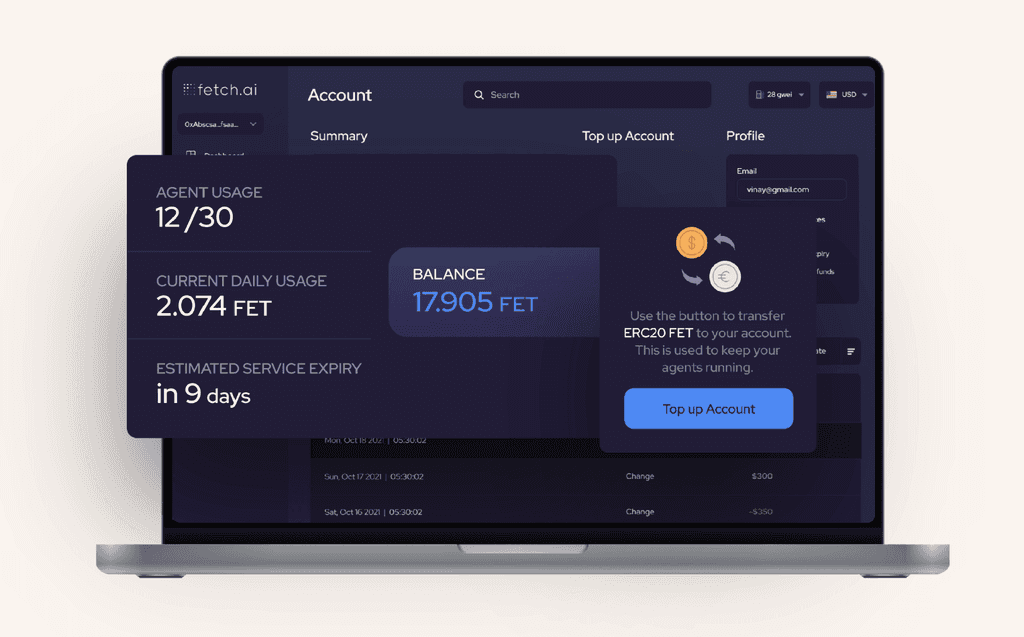


As part of my work as a Lead UI/UX designer for Fetch.ai's decentralized finance (DeFi) platform, I was tasked with improving the transaction experience for our users. Our platform offers a range of payment methods, including various cryptocurrencies, stablecoins, and fiat currencies, but we noticed that users were having difficulty making successful payments on their first try. To address this issue, I worked with our product manager and UX writer to define a system for recommending payment methods based on success rates and transaction costs.
As part of my work as a Lead UI/UX designer for Fetch.ai's decentralized finance (DeFi) platform, I was tasked with improving the transaction experience for our users. Our platform offers a range of payment methods, including various cryptocurrencies, stablecoins, and fiat currencies, but we noticed that users were having difficulty making successful payments on their first try. To address this issue, I worked with our product manager and UX writer to define a system for recommending payment methods based on success rates and transaction costs.
As part of my work as a Lead UI/UX designer for Fetch.ai's decentralized finance (DeFi) platform, I was tasked with improving the transaction experience for our users. Our platform offers a range of payment methods, including various cryptocurrencies, stablecoins, and fiat currencies, but we noticed that users were having difficulty making successful payments on their first try. To address this issue, I worked with our product manager and UX writer to define a system for recommending payment methods based on success rates and transaction costs.
We also redesigned our error messages and bottom sheet to provide clearer feedback and suggest the next best steps for users. After rolling out the new design to a test group of users across different cohorts, we saw a significant increase in payment success rates on the second attempt, as well as a decrease in order cancellations. These results were promising, and we are continuing to experiment with different cohorts and use cases to further improve our payment experience.
We also redesigned our error messages and bottom sheet to provide clearer feedback and suggest the next best steps for users. After rolling out the new design to a test group of users across different cohorts, we saw a significant increase in payment success rates on the second attempt, as well as a decrease in order cancellations. These results were promising, and we are continuing to experiment with different cohorts and use cases to further improve our payment experience.
We also redesigned our error messages and bottom sheet to provide clearer feedback and suggest the next best steps for users. After rolling out the new design to a test group of users across different cohorts, we saw a significant increase in payment success rates on the second attempt, as well as a decrease in order cancellations. These results were promising, and we are continuing to experiment with different cohorts and use cases to further improve our payment experience.
Errors and interruptions can be a frustrating experience for users, especially for a platform like Defi Agents with the goal of onboarding more users and making deposits and withdrawals seamless on their Automation dashboard.
Errors and interruptions can be a frustrating experience for users, especially for a platform like Defi Agents with the goal of onboarding more users and making deposits and withdrawals seamless on their Automation dashboard.
Errors and interruptions can be a frustrating experience for users, especially for a platform like Defi Agents with the goal of onboarding more users and making deposits and withdrawals seamless on their Automation dashboard.
In the beginning of 2022, around 15% of users faced some sort of error on the platform's deposit and withdrawal flow, resulting in a loss of about 10% of those users due to poor handling of the errors. With an average deposit and withdrawal value of $500, the loss due to errors was a staggering $350,000 per day!
In the beginning of 2022, around 15% of users faced some sort of error on the platform's deposit and withdrawal flow, resulting in a loss of about 10% of those users due to poor handling of the errors. With an average deposit and withdrawal value of $500, the loss due to errors was a staggering $350,000 per day!
In the beginning of 2022, around 15% of users faced some sort of error on the platform's deposit and withdrawal flow, resulting in a loss of about 10% of those users due to poor handling of the errors. With an average deposit and withdrawal value of $500, the loss due to errors was a staggering $350,000 per day!
To support the platform's vision of increasing user adoption and making DeFi transactions more seamless, the high-level goal was to make the deposit and withdrawal process more convenient (by reducing friction and complexity) and seamless (by eliminating or handling errors gracefully).
To support the platform's vision of increasing user adoption and making DeFi transactions more seamless, the high-level goal was to make the deposit and withdrawal process more convenient (by reducing friction and complexity) and seamless (by eliminating or handling errors gracefully).
To support the platform's vision of increasing user adoption and making DeFi transactions more seamless, the high-level goal was to make the deposit and withdrawal process more convenient (by reducing friction and complexity) and seamless (by eliminating or handling errors gracefully).
As a Lead UI/UX Designer at Fetch.ai, I led the design of multiple projects within this larger goal throughout the end of 2021 and 2022. I worked alongside product managers, content writers, the research team, and engineers to identify the types of errors users faced, the impact and frequency of each of them, and gather customer insights through user immersion sessions and feedback from teammates and friends.
As a Lead UI/UX Designer at Fetch.ai, I led the design of multiple projects within this larger goal throughout the end of 2021 and 2022. I worked alongside product managers, content writers, the research team, and engineers to identify the types of errors users faced, the impact and frequency of each of them, and gather customer insights through user immersion sessions and feedback from teammates and friends.
As a Lead UI/UX Designer at Fetch.ai, I led the design of multiple projects within this larger goal throughout the end of 2021 and 2022. I worked alongside product managers, content writers, the research team, and engineers to identify the types of errors users faced, the impact and frequency of each of them, and gather customer insights through user immersion sessions and feedback from teammates and friends.
With this information, we defined a set of design principles for handling errors:
With this information, we defined a set of design principles for handling errors:
With this information, we defined a set of design principles for handling errors:
How might we prevent errors in the first place by guiding users beforehand, reducing complexity, and setting expectations?
How might we prevent errors in the first place by guiding users beforehand, reducing complexity, and setting expectations?
How might we prevent errors in the first place by guiding users beforehand, reducing complexity, and setting expectations?
How might we clearly communicate to users what went wrong, why it happened, and what can be done now?
How might we clearly communicate to users what went wrong, why it happened, and what can be done now?
How might we clearly communicate to users what went wrong, why it happened, and what can be done now?
How might we communicate error messages in the right context, using appropriate design patterns?
How might we communicate error messages in the right context, using appropriate design patterns?
How might we communicate error messages in the right context, using appropriate design patterns?
Following were the Use Cases which we focussed and improved upon -
Following were the Use Cases which we focussed and improved upon -
Following were the Use Cases which we focussed and improved upon -
Use Case 1: Navigation
Use Case 1: Navigation
Use Case 1: Navigation
Issue
Issue
Issue
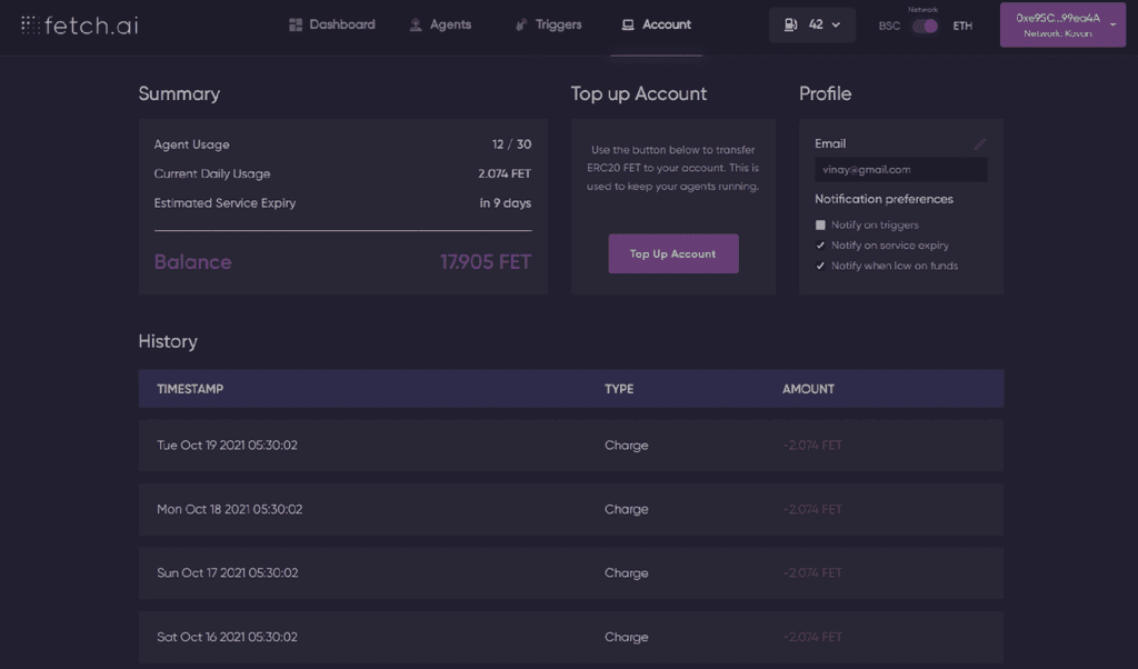
The current navigation for the dashboard was too cluttered at the top, which made it difficult for users to find the desired page quickly. The top navigation bar contained too much information, and it was challenging to distinguish between the active and inactive tabs. The toggle switch used to select the network was confusing, and it looked like both networks were active simultaneously, causing unnecessary confusion.
The current navigation for the dashboard was too cluttered at the top, which made it difficult for users to find the desired page quickly. The top navigation bar contained too much information, and it was challenging to distinguish between the active and inactive tabs. The toggle switch used to select the network was confusing, and it looked like both networks were active simultaneously, causing unnecessary confusion.
The current navigation for the dashboard was too cluttered at the top, which made it difficult for users to find the desired page quickly. The top navigation bar contained too much information, and it was challenging to distinguish between the active and inactive tabs. The toggle switch used to select the network was confusing, and it looked like both networks were active simultaneously, causing unnecessary confusion.
Pain points
Pain points
Pain points
Users were unable to find the desired page quickly. The top navigation bar contained too much information. The toggle switch used to select the network was confusing.
Users were unable to find the desired page quickly. The top navigation bar contained too much information. The toggle switch used to select the network was confusing.
Users were unable to find the desired page quickly. The top navigation bar contained too much information. The toggle switch used to select the network was confusing.


Solutions
Solutions
Solutions
To address the above issues and pain points, the navigation was revamped, and the following changes were made:
To address the above issues and pain points, the navigation was revamped, and the following changes were made:
To address the above issues and pain points, the navigation was revamped, and the following changes were made:


Left Panel for Navigation
Left Panel for Navigation
Left Panel for Navigation
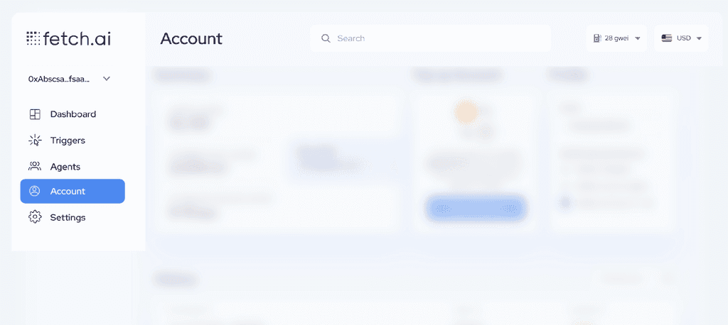
https://tinypng.comA left panel was introduced to display all the sub-pages, which made it easier for users to navigate the dashboard. This left panel was collapsible, which saved screen real estate and gave users more space to interact with the main content.
https://tinypng.comA left panel was introduced to display all the sub-pages, which made it easier for users to navigate the dashboard. This left panel was collapsible, which saved screen real estate and gave users more space to interact with the main content.
https://tinypng.comA left panel was introduced to display all the sub-pages, which made it easier for users to navigate the dashboard. This left panel was collapsible, which saved screen real estate and gave users more space to interact with the main content.
Cleaner Top Navigation Bar
Cleaner Top Navigation Bar
Cleaner Top Navigation Bar
The top navigation bar was made much cleaner, with only relevant information to the users. The menu was streamlined and contained only the most frequently used pages, while the remaining pages were moved to the left panel.
The top navigation bar was made much cleaner, with only relevant information to the users. The menu was streamlined and contained only the most frequently used pages, while the remaining pages were moved to the left panel.
The top navigation bar was made much cleaner, with only relevant information to the users. The menu was streamlined and contained only the most frequently used pages, while the remaining pages were moved to the left panel.
Search the Top
Search the Top
Search the Top
A search bar was added to the top navigation bar, which made it easier for users to find specific pages quickly. Users could type the page name, and the search results would appear, reducing the time spent on searching and navigating.
A search bar was added to the top navigation bar, which made it easier for users to find specific pages quickly. Users could type the page name, and the search results would appear, reducing the time spent on searching and navigating.
A search bar was added to the top navigation bar, which made it easier for users to find specific pages quickly. Users could type the page name, and the search results would appear, reducing the time spent on searching and navigating.
Clearer Network Selection
Clearer Network Selection
Clearer Network Selection
The network toggle switch was replaced with a drop-down menu that clearly indicated which network was active. This change made it easier for users to select the desired network and avoid confusion.
The network toggle switch was replaced with a drop-down menu that clearly indicated which network was active. This change made it easier for users to select the desired network and avoid confusion.
The network toggle switch was replaced with a drop-down menu that clearly indicated which network was active. This change made it easier for users to select the desired network and avoid confusion.
These changes resulted in a more intuitive and user-friendly navigation system, making it easier for users to find the information they needed and reducing the time spent navigating the dashboard.
These changes resulted in a more intuitive and user-friendly navigation system, making it easier for users to find the information they needed and reducing the time spent navigating the dashboard.
These changes resulted in a more intuitive and user-friendly navigation system, making it easier for users to find the information they needed and reducing the time spent navigating the dashboard.
Use Case 2: Top Up
Use Case 2: Top Up
Use Case 2: Top Up
Issue and Pain Points
Issue and Pain Points
Issue and Pain Points
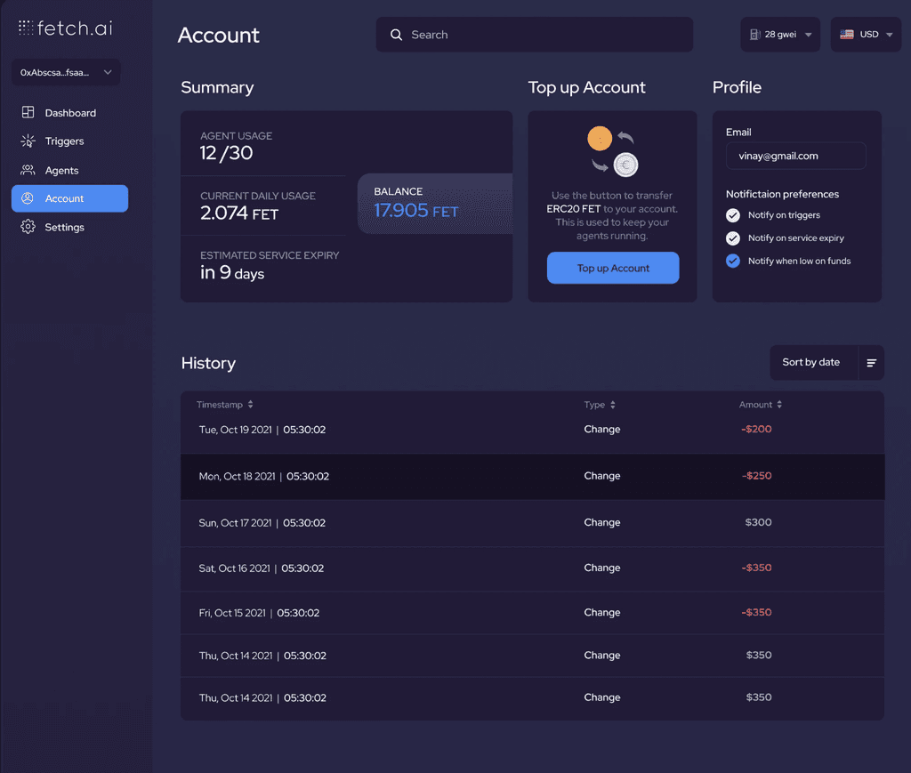
Users of the DeFi dashboard were not able to set notifications for triggers such as low funds or service inquiries. This caused frustration as they were unable to monitor their accounts effectively and may have missed important updates. Additionally, users had to navigate through multiple pages to find the settings for notifications, making the process tedious and time-consuming.
Users of the DeFi dashboard were not able to set notifications for triggers such as low funds or service inquiries. This caused frustration as they were unable to monitor their accounts effectively and may have missed important updates. Additionally, users had to navigate through multiple pages to find the settings for notifications, making the process tedious and time-consuming.
Users of the DeFi dashboard were not able to set notifications for triggers such as low funds or service inquiries. This caused frustration as they were unable to monitor their accounts effectively and may have missed important updates. Additionally, users had to navigate through multiple pages to find the settings for notifications, making the process tedious and time-consuming.


To address these pain points, we proposed the creation of a widget on the dashboard that contained all the necessary options for setting notifications. This widget would contain checkboxes for each type of notification that the user wanted to receive, such as low funds or service inquiries. By placing these options upfront on the dashboard, users could quickly and easily set up their notifications without having to navigate through multiple pages.
To address these pain points, we proposed the creation of a widget on the dashboard that contained all the necessary options for setting notifications. This widget would contain checkboxes for each type of notification that the user wanted to receive, such as low funds or service inquiries. By placing these options upfront on the dashboard, users could quickly and easily set up their notifications without having to navigate through multiple pages.
To address these pain points, we proposed the creation of a widget on the dashboard that contained all the necessary options for setting notifications. This widget would contain checkboxes for each type of notification that the user wanted to receive, such as low funds or service inquiries. By placing these options upfront on the dashboard, users could quickly and easily set up their notifications without having to navigate through multiple pages.
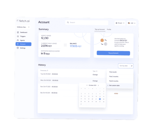
The issue that users were facing was related to the difficulty in topping up their accounts with FET coins, as the network required to transfer the coins was ERC20 and this was not clearly communicated to the users. This lack of clarity resulted in many users losing funds during transactions and this created a negative user experience.
The issue that users were facing was related to the difficulty in topping up their accounts with FET coins, as the network required to transfer the coins was ERC20 and this was not clearly communicated to the users. This lack of clarity resulted in many users losing funds during transactions and this created a negative user experience.
The issue that users were facing was related to the difficulty in topping up their accounts with FET coins, as the network required to transfer the coins was ERC20 and this was not clearly communicated to the users. This lack of clarity resulted in many users losing funds during transactions and this created a negative user experience.
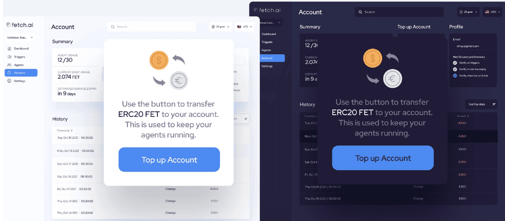
To address this issue, a solution was proposed to clearly communicate the ERC20 network transfer requirement to the users. This was achieved through the use of visual hierarchy and a clear CTA button on the dashboard, which directed users to the correct network transfer option. A widget was also added on the dashboard that highlighted the network option and provided checkboxes to select the amount to transfer, making the process much simpler and more intuitive for the users.
To address this issue, a solution was proposed to clearly communicate the ERC20 network transfer requirement to the users. This was achieved through the use of visual hierarchy and a clear CTA button on the dashboard, which directed users to the correct network transfer option. A widget was also added on the dashboard that highlighted the network option and provided checkboxes to select the amount to transfer, making the process much simpler and more intuitive for the users.
To address this issue, a solution was proposed to clearly communicate the ERC20 network transfer requirement to the users. This was achieved through the use of visual hierarchy and a clear CTA button on the dashboard, which directed users to the correct network transfer option. A widget was also added on the dashboard that highlighted the network option and provided checkboxes to select the amount to transfer, making the process much simpler and more intuitive for the users.
By implementing these changes, users were able to clearly see the options available to them and were able to easily top up their accounts without the risk of losing funds. This improved the overall user experience and made the platform more user-friendly and accessible for all users.
By implementing these changes, users were able to clearly see the options available to them and were able to easily top up their accounts without the risk of losing funds. This improved the overall user experience and made the platform more user-friendly and accessible for all users.
By implementing these changes, users were able to clearly see the options available to them and were able to easily top up their accounts without the risk of losing funds. This improved the overall user experience and made the platform more user-friendly and accessible for all users.
Proposed Solution
Proposed Solution
Proposed Solution
To address these pain points, we proposed the creation of a widget on the dashboard that contained all the necessary options for setting notifications. This widget would contain checkboxes for each type of notification that the user wanted to receive, such as low funds or service inquiries. By placing these options upfront on the dashboard, users could quickly and easily set up their notifications without having to navigate through multiple pages. This would improve the user experience by making it more efficient and intuitive. Additionally, the widget could be designed in a way that was visually appealing and easy to understand, further enhancing the user experience.
To address these pain points, we proposed the creation of a widget on the dashboard that contained all the necessary options for setting notifications. This widget would contain checkboxes for each type of notification that the user wanted to receive, such as low funds or service inquiries. By placing these options upfront on the dashboard, users could quickly and easily set up their notifications without having to navigate through multiple pages. This would improve the user experience by making it more efficient and intuitive. Additionally, the widget could be designed in a way that was visually appealing and easy to understand, further enhancing the user experience.
To address these pain points, we proposed the creation of a widget on the dashboard that contained all the necessary options for setting notifications. This widget would contain checkboxes for each type of notification that the user wanted to receive, such as low funds or service inquiries. By placing these options upfront on the dashboard, users could quickly and easily set up their notifications without having to navigate through multiple pages. This would improve the user experience by making it more efficient and intuitive. Additionally, the widget could be designed in a way that was visually appealing and easy to understand, further enhancing the user experience.


Use Case 3: Trading Pair and Custom filters
Use Case 3: Trading Pair and Custom filters
Use Case 3: Trading Pair and Custom filters
Issue and Pain Points
Issue and Pain Points
Issue and Pain Points
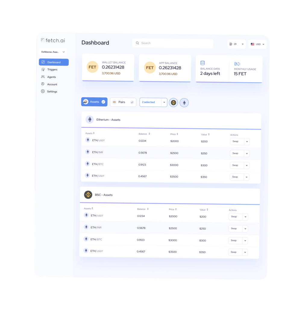
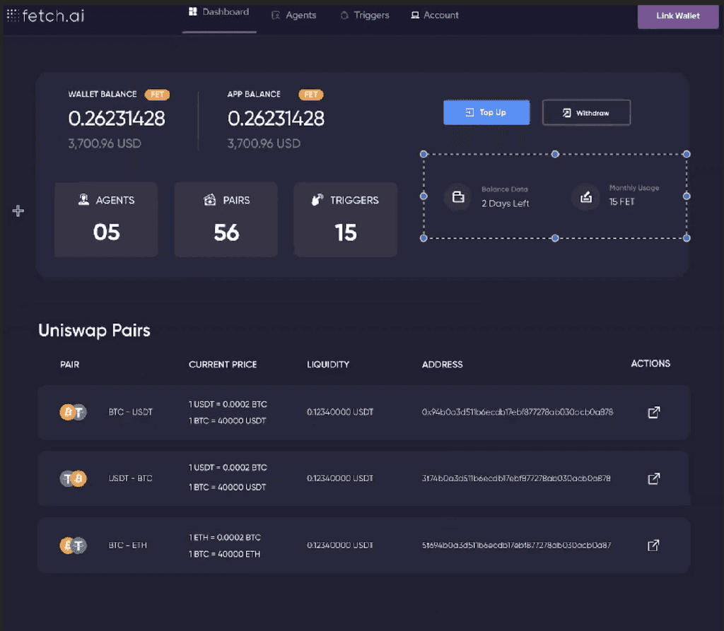
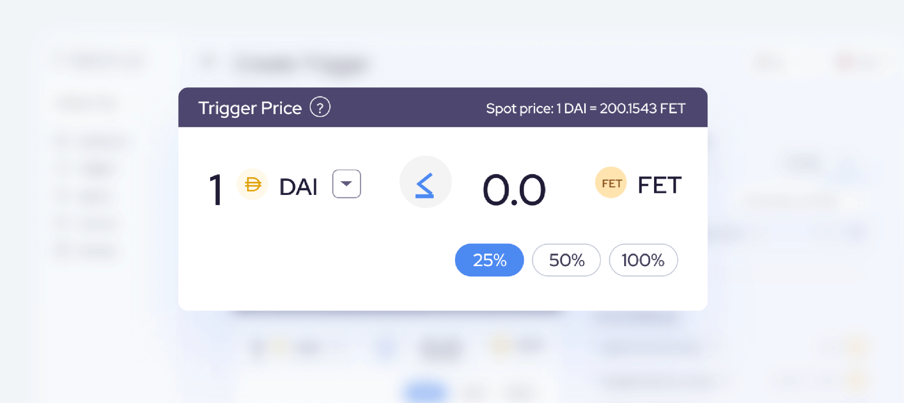
Users were finding it challenging to do a filtered search on the trading pairs available on the DeFi dashboard. The trading pairs were numerous, and users had to scroll through a long list of pairs to find the specific one they wanted. This created confusion and made the process of selecting trading pairs time-consuming and frustrating.
Users were finding it challenging to do a filtered search on the trading pairs available on the DeFi dashboard. The trading pairs were numerous, and users had to scroll through a long list of pairs to find the specific one they wanted. This created confusion and made the process of selecting trading pairs time-consuming and frustrating.
Users were finding it challenging to do a filtered search on the trading pairs available on the DeFi dashboard. The trading pairs were numerous, and users had to scroll through a long list of pairs to find the specific one they wanted. This created confusion and made the process of selecting trading pairs time-consuming and frustrating.


Proposed Solution
Proposed Solution
Proposed Solution
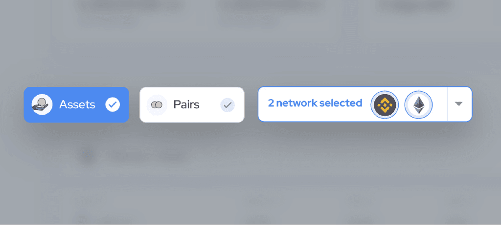
To address this issue, we proposed adding an assets and pairs filter upfront on the dashboard. This allowed users to narrow down the trading pairs based on the specific assets they were interested in and the pairs available. Furthermore, we allowed users to select the network of their choice, which enabled them to focus on trading pairs specific to their preferred network.
To address this issue, we proposed adding an assets and pairs filter upfront on the dashboard. This allowed users to narrow down the trading pairs based on the specific assets they were interested in and the pairs available. Furthermore, we allowed users to select the network of their choice, which enabled them to focus on trading pairs specific to their preferred network.
To address this issue, we proposed adding an assets and pairs filter upfront on the dashboard. This allowed users to narrow down the trading pairs based on the specific assets they were interested in and the pairs available. Furthermore, we allowed users to select the network of their choice, which enabled them to focus on trading pairs specific to their preferred network.




Implementation
Implementation
Implementation
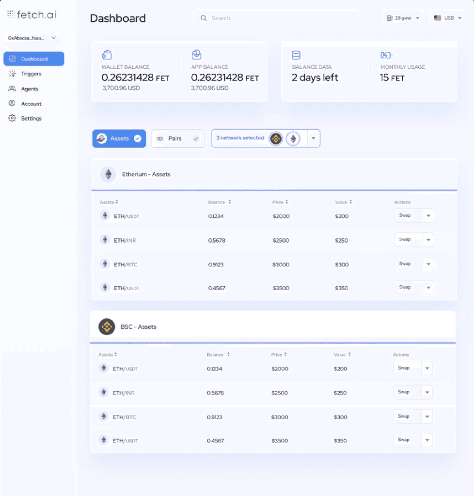
We implemented the solution by creating a widget on the dashboard that displayed the assets and pairs filter upfront. The viewenabled users to select the assets and pairs they were interested in, and it displayed only the relevant trading pairs. We also added a drop-down menu that allowed users to select the network of their choice. This made the process of selecting trading pairs faster and more user-friendly.
We implemented the solution by creating a widget on the dashboard that displayed the assets and pairs filter upfront. The viewenabled users to select the assets and pairs they were interested in, and it displayed only the relevant trading pairs. We also added a drop-down menu that allowed users to select the network of their choice. This made the process of selecting trading pairs faster and more user-friendly.
We implemented the solution by creating a widget on the dashboard that displayed the assets and pairs filter upfront. The viewenabled users to select the assets and pairs they were interested in, and it displayed only the relevant trading pairs. We also added a drop-down menu that allowed users to select the network of their choice. This made the process of selecting trading pairs faster and more user-friendly.
Results
Results
Results
The implementation of the custom filter with the assets and pairs filter upfront, and the network selector has made a significant impact on the user experience of the DeFi dashboard. Users can now easily find the specific trading pairs they want to trade without the need to scroll through a long list. The number of user complaints regarding the difficulty of finding specific trading pairs has reduced significantly, and users can trade with ease and efficiency.
The implementation of the custom filter with the assets and pairs filter upfront, and the network selector has made a significant impact on the user experience of the DeFi dashboard. Users can now easily find the specific trading pairs they want to trade without the need to scroll through a long list. The number of user complaints regarding the difficulty of finding specific trading pairs has reduced significantly, and users can trade with ease and efficiency.
The implementation of the custom filter with the assets and pairs filter upfront, and the network selector has made a significant impact on the user experience of the DeFi dashboard. Users can now easily find the specific trading pairs they want to trade without the need to scroll through a long list. The number of user complaints regarding the difficulty of finding specific trading pairs has reduced significantly, and users can trade with ease and efficiency.
Use Case 4: Triggers
Use Case 4: Triggers
Use Case 4: Triggers
Issue and Pain Points
Issue and Pain Points
Issue and Pain Points
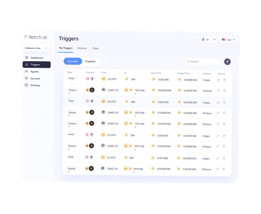
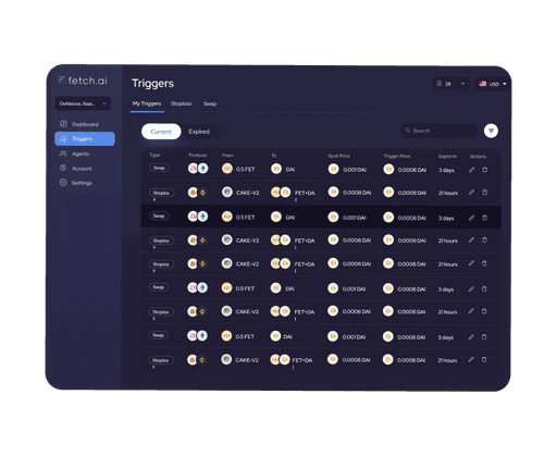
The trigger system on the platform was causing confusion and frustration for users, who were struggling to set triggers properly and distinguish between current and expired triggers. Additionally, there was no ability to search and filter the trigger list, making it difficult for users to find the ones they needed.
The trigger system on the platform was causing confusion and frustration for users, who were struggling to set triggers properly and distinguish between current and expired triggers. Additionally, there was no ability to search and filter the trigger list, making it difficult for users to find the ones they needed.
The trigger system on the platform was causing confusion and frustration for users, who were struggling to set triggers properly and distinguish between current and expired triggers. Additionally, there was no ability to search and filter the trigger list, making it difficult for users to find the ones they needed.

Proposed Solution
Proposed Solution
Proposed Solution
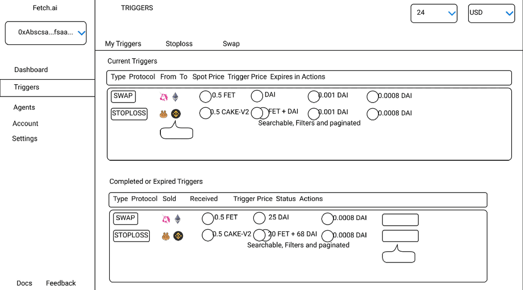
I proposed several solutions to address these pain points. Firstly, I added a clear and easy-to-use trigger setting feature, allowing users to set triggers with ease. Secondly, I included a search and filter option that enabled users to quickly find and select the desired triggers. To distinguish between current and expired triggers, I added clear visual cues such as colors and labels.
I proposed several solutions to address these pain points. Firstly, I added a clear and easy-to-use trigger setting feature, allowing users to set triggers with ease. Secondly, I included a search and filter option that enabled users to quickly find and select the desired triggers. To distinguish between current and expired triggers, I added clear visual cues such as colors and labels.
I proposed several solutions to address these pain points. Firstly, I added a clear and easy-to-use trigger setting feature, allowing users to set triggers with ease. Secondly, I included a search and filter option that enabled users to quickly find and select the desired triggers. To distinguish between current and expired triggers, I added clear visual cues such as colors and labels.
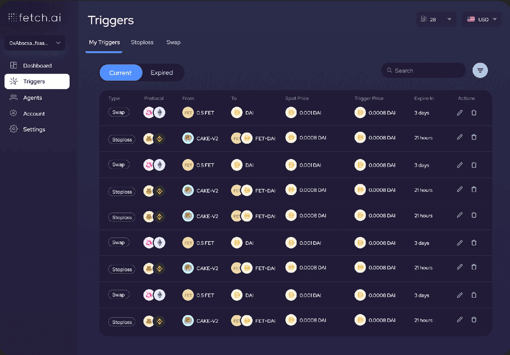


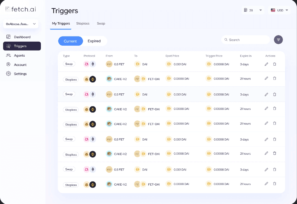


Moreover, I implemented a feature that allowed users to view their trigger history, so they can easily track and manage their triggers. Additionally, I proposed adding a visual indicator to distinguish between current and expired triggers, using a color-coded label or icon for each trigger. This made it easy for users to quickly identify which triggers were active.
Moreover, I implemented a feature that allowed users to view their trigger history, so they can easily track and manage their triggers. Additionally, I proposed adding a visual indicator to distinguish between current and expired triggers, using a color-coded label or icon for each trigger. This made it easy for users to quickly identify which triggers were active.
Moreover, I implemented a feature that allowed users to view their trigger history, so they can easily track and manage their triggers. Additionally, I proposed adding a visual indicator to distinguish between current and expired triggers, using a color-coded label or icon for each trigger. This made it easy for users to quickly identify which triggers were active.
Another quick solution I proposed was to add a row to the trigger table that highlights when the triggers expire (in how many days). This would help users stay on top of their triggers and make sure they don't miss any important events. Finally, I added an option for users to receive notifications when their triggers are triggered, providing them with a seamless experience and increasing user satisfaction.
Another quick solution I proposed was to add a row to the trigger table that highlights when the triggers expire (in how many days). This would help users stay on top of their triggers and make sure they don't miss any important events. Finally, I added an option for users to receive notifications when their triggers are triggered, providing them with a seamless experience and increasing user satisfaction.
Another quick solution I proposed was to add a row to the trigger table that highlights when the triggers expire (in how many days). This would help users stay on top of their triggers and make sure they don't miss any important events. Finally, I added an option for users to receive notifications when their triggers are triggered, providing them with a seamless experience and increasing user satisfaction.
Overall, these solutions provided users with a more intuitive and user-friendly experience, allowing them to easily set and manage their triggers on the platform.
Overall, these solutions provided users with a more intuitive and user-friendly experience, allowing them to easily set and manage their triggers on the platform.
Overall, these solutions provided users with a more intuitive and user-friendly experience, allowing them to easily set and manage their triggers on the platform.
Use Case 5: Light and Dark Mode
Use Case 5: Light and Dark Mode
Use Case 5: Light and Dark Mode
Problem 1
Problem 1
Problem 1
Dark mode might not be suitable for users with visual impairments or eye strain.
Dark mode might not be suitable for users with visual impairments or eye strain.
Dark mode might not be suitable for users with visual impairments or eye strain.


Proposed Solution
Proposed Solution
Proposed Solution
Offer an option to choose between different shades of darkness, or a high-contrast version for users with visual impairments. Also, provide users with the ability to switch back to light mode at any time.
Offer an option to choose between different shades of darkness, or a high-contrast version for users with visual impairments. Also, provide users with the ability to switch back to light mode at any time.
Offer an option to choose between different shades of darkness, or a high-contrast version for users with visual impairments. Also, provide users with the ability to switch back to light mode at any time.


Problem 2
Problem 2
Problem 2
Design elements and text might not be legible or contrast enough in one or both modes.
Design elements and text might not be legible or contrast enough in one or both modes.
Design elements and text might not be legible or contrast enough in one or both modes.
Proposed Solution
Proposed Solution
Proposed Solution
Use appropriate colors and font sizes to ensure that elements are legible and contrast well in both modes. Test designs with actual users in both modes to ensure optimal contrast and legibility.
Use appropriate colors and font sizes to ensure that elements are legible and contrast well in both modes. Test designs with actual users in both modes to ensure optimal contrast and legibility.
Use appropriate colors and font sizes to ensure that elements are legible and contrast well in both modes. Test designs with actual users in both modes to ensure optimal contrast and legibility.


Problem 3
Problem 3
Problem 3
Users might prefer different modes based on context or preference.
Users might prefer different modes based on context or preference.
Users might prefer different modes based on context or preference.
Proposed Solution
Proposed Solution
Proposed Solution
Allow users to switch modes easily and quickly, using a toggle or button in a prominent location. Also, provide users with the ability to set a default mode for their account if they have a preference.
Allow users to switch modes easily and quickly, using a toggle or button in a prominent location. Also, provide users with the ability to set a default mode for their account if they have a preference.
Allow users to switch modes easily and quickly, using a toggle or button in a prominent location. Also, provide users with the ability to set a default mode for their account if they have a preference.


Designing the Experience
Designing the Experience
Designing the Experience
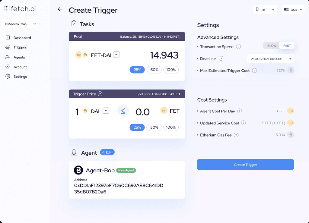
Based on our design principles, we wanted to suggest the next best step for users of the Fetch.ai Defi automation platform. We decided to recommend a set of automated trading strategies based on the user's risk profile and investment goals. After some initial feedback from the design team, we realized that users might have an unusually high affinity towards their own trading strategies, even if they weren't successful. To confirm this with data, we analyzed user behavior and found that many users preferred to stick with their own strategies, even if they weren't performing well.
Based on our design principles, we wanted to suggest the next best step for users of the Fetch.ai Defi automation platform. We decided to recommend a set of automated trading strategies based on the user's risk profile and investment goals. After some initial feedback from the design team, we realized that users might have an unusually high affinity towards their own trading strategies, even if they weren't successful. To confirm this with data, we analyzed user behavior and found that many users preferred to stick with their own strategies, even if they weren't performing well.
Based on our design principles, we wanted to suggest the next best step for users of the Fetch.ai Defi automation platform. We decided to recommend a set of automated trading strategies based on the user's risk profile and investment goals. After some initial feedback from the design team, we realized that users might have an unusually high affinity towards their own trading strategies, even if they weren't successful. To confirm this with data, we analyzed user behavior and found that many users preferred to stick with their own strategies, even if they weren't performing well.
To address this issue, we decided to keep the current method along with the suggestion. We explored different design options to make the process more user-friendly and informative. We realized that error communication was vague, and we needed to bring out the message with more empathy. After several iterations, we came up with a design that clearly called out the error feedback and message in the header, and we showed two trading strategies: the recommended one and the recently failed one.
To address this issue, we decided to keep the current method along with the suggestion. We explored different design options to make the process more user-friendly and informative. We realized that error communication was vague, and we needed to bring out the message with more empathy. After several iterations, we came up with a design that clearly called out the error feedback and message in the header, and we showed two trading strategies: the recommended one and the recently failed one.
To address this issue, we decided to keep the current method along with the suggestion. We explored different design options to make the process more user-friendly and informative. We realized that error communication was vague, and we needed to bring out the message with more empathy. After several iterations, we came up with a design that clearly called out the error feedback and message in the header, and we showed two trading strategies: the recommended one and the recently failed one.
Style Guidelines
Style Guidelines
Style Guidelines
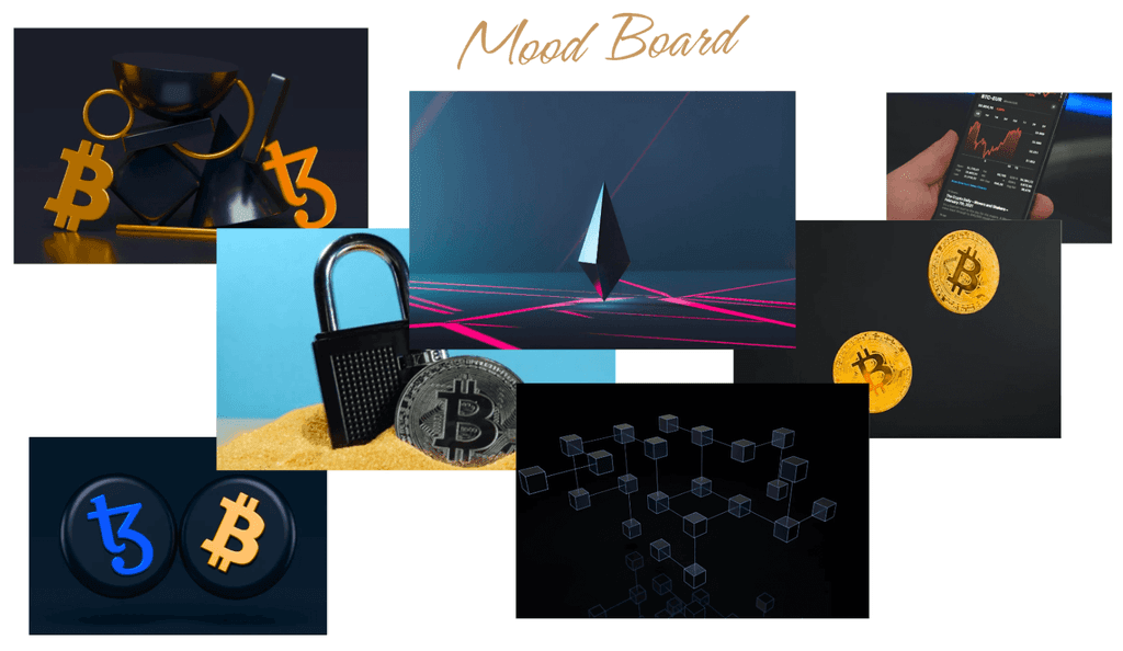
We employed a dark & vibrant style to replicate characteristics
of Fetch.ai DeFi Dashboard.
We employed a dark & vibrant style to replicate characteristics of Fetch.ai DeFi Dashboard.
We employed a dark & vibrant style to replicate characteristics of Fetch.ai DeFi Dashboard.
Typography
Typography
Typography
Aa
Aa
Red Hat Display
Red Hat Display
Red Hat Display
Defi just got simple
Defi just got simple
Defi just got simple
ABCDEFGHIJKLMNOPQRSTUVWXYZ
ABCDEFGHIJKLMNOPQRSTUVWXYZ
ABCDEFGHIJKLMNOPQRSTUVWXYZ
abcdefghijklmnopqrstuvwxyz
abcdefghijklmnopqrstuvwxyz
abcdefghijklmnopqrstuvwxyz
0123456789
0123456789
0123456789
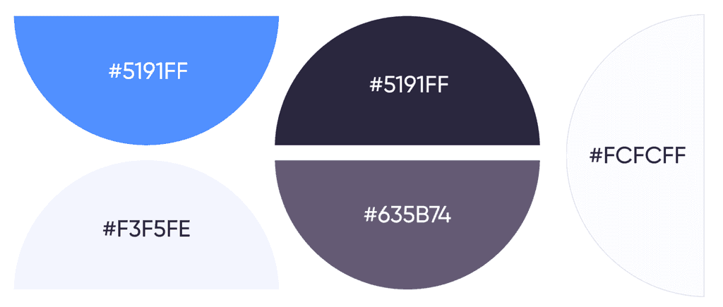
Color Palette
Color Palette
Color Palette

Showcases
Showcases
Showcases
